Wednesday 28 March 2012

Canary Yellow with a 50s Vibe

Firstly, let me apologise for my absence of late. Many things have kept me distracted. Firstly, my long time boyfriend finally proposed after 10 years (!) of “courting”. As you can imagine, I have 10 years build-up of marriage related ideas which I had to explore immediately. This has lead me to look into designing my own wedding stationary and has developed into a little business idea. So, with daydreaming of weddings and my possible business venture (which shall remain an idea for a little while longer I imagine, if ever becomes anything more) I have not thought about anything remotely interior design based which would be worth noting on here. Add to that, my daughter is at a rather interesting age (10 months now, blimey its gone fast) and is trying her level best to walk. This is causing me to be both physically and mentally exhausted come the evening, when I usually dedicate my spare time to The Blog.


 BUT, did you notice spring has suddenly arrived?! Yes folks, spring is officially here and the fresh spring light has shined through my windows and into my humble home… which is still in need of decorating. And in true spring-cleaning like gusto, I’m back on the case and keen to get cracking again.
One room which has not been touched yet is our Spare Bedroom. For a long time, in fact since we moved it, it has been a junk room. All the stuff which we’d acquired in our old house and didn’t have a place for has been piled up and I had mentally closed the door to the issue. Temporarily. But with lovely weather and that burst of energy that seems to come with spring, I’ve managed to clear most of it away. So, now to the fun part: getting a moodboard together.
I’m LOVING yellow at the moment – not sure if I’m a couple of years behind a trend here or too trendy for my own good, but there is not a vast amount of yellow currently on our high streets. Green, yes. Teal, yes. Red, yes. Yellow… not so much. But it’s such a gorgeous colour in my opinion, so fresh and gender-neutral, I’m really keen to use it in our Guest Bedroom. I’m also looking for a little bit of a quirky edge on it too, and would love to incorporate a 50’s vibe. So, for the time being, I’ve done a little sketch and am working on a moodboard. Most of our furniture will be second hand here, so I want to pull it all together by making bold statements of Black, White and Yellow. Its gona be great… trust me, I’m a designer.

Mx

Sunday 11 March 2012

March: Tackling the Garden

Now, this post is a bit away from the norm - it has nothing to do with Interior Design for one thing - but as gardening is also one of my passions and I do feel that a garden is just like and outside "room" anyway, I decided to include it. And also, it will inevitably be taking up a large portion of my spare time in the coming months so it'll be handy to include it on the blog.
It's March, folks, and that means one thing: SPRING IS HERE! the clocks may not have sprung forward just yet, but its definitely the time to be gearing your garden up for the coming months, particularly if you plan on growing your own like we are.


GROW YOUR OWN VEG...
I'm not an amazing gardener - I'll say that upfront. I'm amateur at best... in fact beginner is maybe more apt. I've dabbled at gardening, but never approached it with real gusto and planning. But, with the new home, I really intend to do it right this time, and i find it best to start simple.
We have a very small patch in the north west corner of the garden - it does get good light despite its location as the buildings around us are very low. The back wall of the garden actually gets hit by the southern sun for most of the day, so I'm hoping this will yield some great results veg-wise. So it is here that i am beginning.

JOB 1: Clearing the ground
Though its a small area (barely 1.5m x 1m) you'd be amazed at how many leaves and garden debris had accumulated on the earth. So job 1 was to fork and clear the ground, removing and leaves and weeds which were emerging.
JOB 2: Fertilising the Soil
All soil needs fertilising to prepare for growing vegetables - I've used a general fertiliser which I scattered over the soil, forked in and then watered. This will give the veg a good foundation for growth (much like decorating, its the prep work which really matters)


JOB 3: Selecting the Veg
As I've decided to tackle things slowly and develop my skills, I've opted for a nice easy-to-grow vegetable: Onions. I've picked two varieties, a white "Stuttgarter Giant"  and a "Red Baron" salad variety. As Onions are used in 90% of my cooking, I know they'll get used and they store really well - this is why I'm growing my own veg after all - so it seemed an obvious choice.
JOB 4: Planting
I marked out lines and made small holes about 3cm deep and 12cm apart  - I could fit about 40 bulbs in the area so I chose to plant 20 of each variety. Placing the bulb in, roots down, It was a simple case of covering them up, Marking the line with a little Label and watering in.


JOB 5: Waiting
So now, after a total of 1 hour in the garden, I've only got a wait of around 6 months or so before the onions are ready for me to interfere again. Until then, its just regular watering, feeding and ground maintenance.
Simples :)

Wednesday 7 March 2012

His & Hers: The Future of Bedroom Design?

I was watching UP the other day (of course, my 9 month old daughter was watching it and I just happened to glance at the TV while doing housework. Yeah right) and just after the heart-breaking story of Ellie’s death, we see Carl Fredricksen sitting in his bed. It’s a sad little scene: Old Carl, grumpy face, clearly sitting on his side of the bed; Another day without his wife, sob. And in this momentary view, we see a teeny tiny insight into their love.

So many stories focus on the beginning of love: the exciting part where it’s all lust and passion and “I can’t live without you” and “I must have you now”. We’ve all been there. But few stories look at love in the real sense: the part beyond the throws of passion, beyond the marriage proposal, wedding and honeymoon period. This is day to day love – the boring kind. But look into your grandparents eyes, and that’s what they have. That’s what we all want, really. And that’s what Karl and Ellie had.

So, how did they survive a lifetime together? What was their secret? We’re shown how they were total polar opposites from the moment they met: Carl the quiet type, with a passion for the mechanics of the world and with a rather square face; Ellie with her bold personality, passion, love of adventure and Oval face. But they share a single dream: to travel to South America. That’s like America, but South. I think the answer is simple: They are two halves of the same whole. Ying and Yang, slotting together to make a compete piece. Carl brings the stability Ellie needs, and Ellie provides the excitement. It’s a mutual, equal relationship.
Anybody who has been in a relationship for a long time will tell you it’s about Compromise. So, when it comes to the Bedroom (and I mean Bedroom Design of course), should there be compromise here too? Design can easily sway to the Feminine or Masculine. Shabby Chic = Feminine. Urban Modern = Masculine. But can the two exist together? Compromise says yes, as long as they complement one another. And no, I’m not saying that shabby-chic-urban-modern is a new upcoming trend that you should watch out for, because that’s just silly.

So, I’ve drawn together a little “his and hers” bedroom scheme. I’ve opted for a monochromatic palette (neither male nor female as a rule) and have allocated the black to the feminine and white to the masculine side (which is maybe a little unconventional). I think by using simplistic furniture with some feminine detailing for the female side and dynamic, solid pieces for the male, a real fusion can be achieved. And I’ve done it all on super bargain budget as 90% of the items are available from Ikea!
Have you achieved a perfect unity of male and female in your bedroom design? If so, we’d love to hear how!

Saturday 3 March 2012

Inspired by Fashion: Kendi's Buildings & Books

I've said it before and I'll say it again: Interiors follow Fashion. By fashion, I mean those rags you casually throw on every morning without second thought. Or rather, I mean it follows the fashion of those folks who do give a second thought to their daily attire, and in fact give rather more than just a second thought - they give a third and fourth thought too I imagine.

Sadly, I am not one of these people. Though I am quite capable of appreciating a good outfit, I am not and have never been, a fashionable trend setter type person. I am at best a distant admirer of fashion. I'm aware its there. And I do follow a couple of fashion blogs - one of which has given me a swell idea for an ongoing series of posts.

If you are not aware of its existence, I recommend you hop along to Kendi Everyday - a fashion blog which focuses on the fashion of one young trend setter in Dallas. Not every day, but almost, she uploads some snapshots of her outfit for the day with a few choice words and makes it look incredibly easy. And though I know that those great outfits will not look anything like that on me (having not been blessed with a model-like physique) the colours, fabrics and patterns do inspire me.

So, in a round about way, I'm trying to tell you about my new post idea. I shall compose a little interior scheme around an outfit which had been caught in my peripheral vision and has thus inspired me. Hence, Inspired By Fashion. And, to kick start this all of, I have selected this outfit showcased by Kendi last week.


The colour palette is dark - rich warm browns and black. The outfit incorporates contrasting fabrics: leather boots repesented above in the chair, and a sheer blouse represented above by the soft voile window treatment. The wallpaper options pick out the pattern detail and are both available from Cole & Son. The overall look Kendi achived looked smart, yet comfortable, so i've tried to reflect that here with non-fussy furniture with soft detailing.

So... what do you think? x

Wednesday 29 February 2012

Weekly Inspiration #4


So this week, I've been feeling the Orange vibe. I'm also loving the idea of male/female sides of a bedroom (as shown in Disney pixar's UP) and incororating a division screen into our master bedroom somehow. Also, I loved a Portrait Wall I saw at a friends house the other day which climbed the staircase and looked brilliant. And finally, I've been truely inspired to launch an "Inspired by Fashion" series of Interior scheme posts after reading one of my favourite Fashion blogs, Kendi Everyday - keep your beady eyes peeled for the upcoming post this weekend!

Saturday 25 February 2012

Get the Look: MAISON MOSCHINO IVY ROOM

If you recall a few months back I posted a Hotel feature on the Maison Moschino in Madrid and have decide to include this in my "Get the Look" range - and I highly recommend you do get the look as its surprisingly simple to do, and far more achievable than some other Hotel schemes to implement in your own abode.


Firstly, the rooms are imaginative and fun - both key factors in replicating the look - but not entirely practical (rose petal bedspread = not easy to wash!) so its not necessarily a bad idea to deviate slightly from the actual hotel rooms and go at little less OTT. I've looked at two of the rooms - the Ivy room and the Rose room so far - my favourites. I'm saving the Rose room for a later date, but for now...

Here is the Ivy Room Scheme:


The main feature of this room are the stripes. I think you could go with a dark olive or dark blue and achieve the same result - I've shown dark blue in the below scheme as its widely available and a little cheaper. Ikea have some blue & white striped fabrics in store, but I've shown William Yeoward in my scheme as he does a matching St Ives wallpaper.
The bed style requires a decorative ornate headboard which is both framed and upholstered (ideally customers-own-fabric so you can get the stripe) so the frame helps define the headboard against the matching striped wallpaper. The bed below is from Stokers and is called Sofia, but you could use a divan bed with separate headboard (if on a tight budget, headboards of this style can often be picked up at House Clearance shops or even Charity shops for a bargain price, leaving the relatively simple task of upholstering the board in your chosen material.
The Ikea staple, Hemnes Bedroom furniture, is a close match in terms of style and colour, though french shabby chic furniture would also work for a more decorative look. Top the bedside off with a simple shaded lamp.
Finally, add an Ivy garland and drape up the wall. These are available at many garden centres and would really complete the look.

Wednesday 22 February 2012

Colour Wheel: OLIVE GREEN

This is a new type of post I’m trying out. Basically, I plan on selecting a colour and creating a little bedroom scheme around it. This week, I’ve opted for Olive Green.

For paint, I’ve picked Olive by Farrow & Ball – it has a little bit more pigment than Lichen but isn’t as overpowering as a lime would be. Green is also a great basic colour to work alongside dark woods – I’ve shown it here with Walnut Engineered flooring though Thermo Fumed Oak would work just as well. In the furniture, I’ve mixed walnut and wenge – I find that with wood its often good to mix, especially when the wood is darker in tone. This gives more depth to a scheme and helps create highlights. I’ve used walnut and wenge combinations many times and really like the overall effect.
To complete the palette, I’ve teamed the Olive with a rich Dark Chocolate and Mink, with white linen bedding and a selection of green shaded scatter cushions. I love the chair as it gives a nice strong statement – very masculine – and opted for a feature pendant light to add interest.

Though I haven’t used any in the visual I’ve drawn up, there are some nice wallpapers which would work with this palette. Here are a couple from Graham and Brown – I particularly like the Brown “Jazz” swirls which add a little feminine touch.
Have you used Olive in your bedroom? If so, what colours did you mix it with?
Mx

Saturday 18 February 2012

Designer Focus: Vivienne Westwood

It’s fair to say that Vivienne Westwood fashion is unique. You certainly wouldn’t confuse it with being, say, Armani or Paul Smith. It is iconic of the British Punk era of the 1970s, with strong Patriotic statements and Festish inspired accessories – it’s difficult to think of Westwood without simultaneously imagining Johnny Rotten and the Sex Pistols. And the same ethos has been implemented to her dabbling in the Interior world, creating edgy Punk inspired pieces to inject some mischief into the home. In conjunction with Cole & Son Wallpapers and The Rug Company, Westwood has created a small selection of Punk items – so here a just a few.

The rugs are great – real statement pieces which strike a political point as well as a fashionable one. Unfortunately, the prices are about as far away from the grass roots of Punk Fashion as you could imagine, but that’s fashion for you. This is Interior Design for Rock Stars as you’d be pushed to afford any on a normal income.

The wallpapers are by far more affordable and can have an equally dramatic impact on a room. Teaming any of these designs with traditional furniture (think worn leather wingback chairs) and you’re onto a winning Punk look.

Tuesday 14 February 2012

Weekly Inspiration #3


Well – I think it’s fair to say I’ve failed miserably on my New Year’s resolution to post a weekly inspiration montage, considering it’s the 14th February and I’ve only just posted my 3rd one! Oops. Bi-weekly is perhaps more accurate, but that doesn’t have quite the same ring to it does it?!
This past week or so, I’ve been feeling all Loved Up. Yes folks, it’s Valentine’s day and Love is All Around. So I’ve been looking at romantic images – you know the sort – rose petal scattered beds, candlelit dinners and open fires. But I’ve also gone a little abstract as well: writing desks are such a romantic piece of furniture don’t you think? Long before email and instant messaging, Writing Desks were privy to all our romantic musings. I’d like to think that people still write – pen to paper – and commit their feelings with ink. Never had a love letter yet, but I’m still young… Also, I’m still perusing the web for new bedding with our second bedroom in mind, and looking for an inspiring colour palette too.
What’s got your design juices flowing this Valentines week…?

Sunday 12 February 2012

Get the Look: DESPERATE HOUSEWIVES RENEE


As the vixen on Wisteria Lane with boodles of cash and the co-founder of an Interior Design company to boot, Renee’s Bedroom had to be really impressive to match the character. And it is. In fact, the whole house (formerly home to Edie Britt before her untimely demise) is decked out in some fabulous interior wares. Needless to say, there are a few designer labels dotted about the place. This last season has given us some great shots of Renee’s home, from her textured wall on the stairwell to the uber modern kitchen. I managed to capture a few screenshots of the bedroom and have compiled a little moodboard for anyone looking to create a Renee style boudoir.

The bedding I tracked down at Macy’s and is currently on offer. The bronze tones are complimented by the mocha wallcolour. Combined with splashes on Turquoise, the milky brown is then subdued with white furniture. Though I couldn’t locate the exact pieces used on the show (I’m not from the states and have limited knowledge of their interior industry) I did find some suitable pieces by Italian designer SMA – available at various stockists around Europe. Top it all off with a velvet upholstered Chaise Longue with scroll top detail and you’re onto a winner. The must have piece is the upholstered bed – I found a good match at High Fashion Home – with a high headboard, deep button detailing and winged sides.

Happy shopping!
Mx

Saturday 11 February 2012

NURSERY RHYMES: photo showcase


This is really more of a "story so far" kind of post. Its significantly nicer than the original room with its plain magnolia walls and beige carpet, but its not quite there yet. I have many things I plan on implementing over the coming months, for instance:
  • Tissue Paper Pom Poms are a must - the ceiling height looks vast at the moment and for a box room, it needs bringing down a little bit visually, so pom pom clouds should do the trick.
  • Silver Birch stump Table - currently, i have an old bedside unit with a wicker drawer in which solves some minor storage issues and gives me a place for the baby monitor to sit, but I'd love a little tree stump instead to complete the woodland theme. Fortunately, I have a friend who is a Tree Surgeon so he's keeping his beady eyes peeled for me.
  • Wardrobe - we got this bargain from Argos. the reason its a bargain is because its unfinished. As the cot is second hand and a varnished pine, it would make sense to varnish this too - but i don't like that idea. So i do plan on painting it white, when my daughter has outgrown her cot. So, in about 3 years.

There are also a few pieces just to dress the room I'm looking for, and I'm sure these will pop into my peripheral vision at some point. Anyway, hope you like the photos!

Mx

Wednesday 1 February 2012

HOME IMPROVEMENT: Master Bedroom Photo Showcase


So, its not quite complete just yet, but the room is finally coming together. To summarise the scheme so far:
  • The walls have been re-neutralised to a "contemporary" off white with splashes of lime/mint and chocolate.
  • Curtains are a recycled feature of our old living room, by Montgomery
  • The Bedstead is the Leamington by Next
  • Throw from (*shocked face*) Sainsburys
  • Bedding from Next
  • Wardrobe by Argos
  • Bedsides & Chest Of Drawers by Ikea
A lot of our bits and pieces are not new, as we've lived together for almost 8 years now and have acquired things along the way. But the two large pieces (bed & wardrobe) have been bought with longevity in mind and we searched around for the bargains.


The room is not completely dressed yet. I'd like to really make a feature of the bedding and am considering buying some egyptian cotton of a good quality high thread count (600 if i'm lucky). Also, when money is not such a deciding factor, i'd like to incorporate a stunning wallpaper, like the "Elementi Fiamma" by Zoffany. This would look amazing with the zesty greens already used.

Tuesday 31 January 2012

Neutral Colour Palettes: DARK vs LIGHT


If you’re considering a neutral colour palette for a room, the paint colour which immediately springs to most people’s mind is the great British painter’s staple: Magnolia. But there are various different ways to approach a neutral colour palette.
If you ask an Architect to pick a neutral paint colour for a design, the answer will invariably be White. Brilliant White. This is because white highlights Architectural designs without distracting. White looks lovely on smooth plastered walls and it helps people notice the building design and room proportions: exactly the parts which an Architect is most proud of.
If you ask an Interior Designer to select a neutral paint colour, they’ll offer you anything but white. Taupe, Dove Grey, Camel, Pebble, Mink – just to name a few. Often, these will be from the darker end of the neutral scale – used to create intimate spaces with light pockets and dark corners. This removes the boundaries of a room, making the actual proportions less noticeable and therefore highlighting the room content.

I’ve selected a few choice images of neutral bedroom schemes from both ends of the neutral scale – from light airy beige through to deep earthy browns. You'll notice the paler palettes use darker tones or patterns as a feature, whereas the dark rooms use punches of light to frame or enhance the details.

I think that ultimately, the darker the palette, the more sophisticated the overall look becomes. Is this because we grown ups maybe don't like how things look in the harsh light of day? Perhaps! But also, a darker palette conceals a multitude of sins and therefore stands a better chance of creating a pleasing result.


So... which colour will you be painting your room? Are you a fan of the classic Magnolia, or would you prefer a dove grey backdrop, we'd love to know!
Mx

Wednesday 25 January 2012

DESIGNER FOCUS: Orla Kiely

She’s become such a success of recent years, chances are you’ve come across Orla Kiely designs in numerous forms. Her fashion line is right up my street – 50’s and 60’s revival, using textured fabrics and retro proportions and cuts to create timeless designs. Her homeware products bend a little bit more towards the 50’s I think, using nature to inspire geometric patterns and neat colour palettes. The most common design I’m aware of is the multi coloured stem print design which has been transferred onto a wealth of merchandise from Radios to cushions to mugs.

Here are a few of my favourite images showing her Interior items. I’m loving the wallpaper in the kitchens but sadly I cannot afford £62 a roll… but if you can, then Heals is the place to go. But I bet there are a few copycat designs available – I shall be perusing Graham & Brown later to see if I can find one for my own home. Also, check out the fab “carpark” duvet covers, currently on sale at Dotmaison.com – I just love the simplicity.

Wednesday 18 January 2012

NURSERY RHYMES: moodboard

So, having thoroughly scoured the internet for design inspiration and having had some excellent luck in stumbling across some great products, suppliers and DIY tutorials, I am now officially ready to unveil my nursery moodboard.
Drumroll please. Brrrrrrrrrrrrrrrrrr…..

Ta da! I’ve finally decided to go with a woodland theme. Think Alice in Wonderland meets the Gruffalo. I really want to create a space which inspires my daughter’s imagination; so when she’s older and playing with her toys, the room becomes part of the adventure. I want it to last for her childhood, so don’t really want to make it too babyish, so am keen to incorporate some aspects which she won’t necessarily appreciate just yet.
I love these paper pom poms which I’m very keen to make. The wall tranfers have already arrived and I’m about to press the order button on the art print. Keep your eyes peeled for an upcoming completed room post! :D
Mx

Tuesday 17 January 2012

Weekly Inspiration #2


So, this week I’ve been looking at adding a splash of colour to the Nursery and for those of you who read last weeks’ Nursery Design post, you’ll know I was also looking at wall transfers and some very inspiring nurseries on Cheap & Chic blog. So here is a little sampleboard of this weeks’ inspirational images. I’m LOVING Ann Kelle’s fabrics which I came across accidentally and in particular the Argyle pattern, Remix. I’m seriously looking at using this for curtains in the Nursery. And I’ve also been looking at neat storage solutions and am loving the suggestion to take photos of shoes and put them in plain boxes to give a clean closet interior. Yum.

Tuesday 10 January 2012

Nursery Design: Essential Buys and Inspiration

I’ve not yet begun to decorate my Daughters nursery but have been looking around for ideas. As our previous home was rented and we planned to buy a house shortly after the birth, we never actually did the “decorating the nursery” bit before she was born. But as we’d have gone down a very neutral route anyway, having not known whether she was in fact a she, I’m sort of grateful we didn’t waste our money.
Most of the furniture we acquired pre-birth was done on less than a shoestring budget. I was really overwhelmed during my pregnancy as to how much money you apparently need to fork out on a baby. Cot, car seat, pram, clothes, bedding etc is all uber expensive. And when you haven’t a clue as to what a baby actually needs, it can be really overwhelming as to what you should or shouldn’t buy. So we were really thrifty and spent less that £200 getting ready – including all the big purchases. I’m really proud of that. If any of you are expecting, here is my take on nursery equipment: what’s worth spending your money on and what really can be ignored.
MUST HAVE BUYS:
·         A Cot Bed – Ours cost £40 second hand and it’s a good, sturdy make. And its suitable from birth up to about 4 years of age so you really get your money’s worth.
·         Cot Mattress – if you go with a cot bed, it’s worth bearing in mind that your child will be using the same mattress for up to 4 years, so it needs to be durable and provide them with good support. It can be tempting to opt for a foam mattress if your budget is really tight (as they retail at about £40 on the highstreet) but don’t be hasty. We shopped around and bought a sprung mattress off an Ebay shop for just £34. Its brilliant quality and would cost upwards of £90 for one from mothercare and over £120 from Mamas & Papas.
·         Changing Mat – Nothing prepares you for how many nappies you’ll be changing in the first few weeks after childbirth. And how messy the whole process is. Though we had a girl, we still had many an “accident” during nappy change – the fresh air on a naked bottom causes all kinds of mishaps! So a mat is essential. I never bought the small towels which lie on top of the mat as I found an old towel was more than adequate.      
·         Wardrobe – We’ve only just bought a wardrobe and we really struggled up until now in terms of storage. So many people buy your child clothes after they’re born, you’ll be amazed at how many styles are available. And you end up having a whole load of clothes which don’t yet fit but still need storing. We opted for a robe with 3 drawers along the bottom too as that gave a storage solution for the bedding and blankets too.
·         Small Basket – I found that babies need a lot of toiletries – it’s almost unbelievable. It’s really helpful to have somewhere to store all the bits together, if only to keep the room in some sort of order. So I recommend getting a little basket to keep all toiletries in for nappy changes and bathtime, meaning everything is easy to find and nearby.
·         Fitted Sheets, Sleeping bag & Swaddle blanket – all essential bedding. Don’t underestimate how good swaddle blankets are for helping get your baby off to sleep in the first few weeks! And the sleeping bags remove any worry about them getting tangles up in blankets when they start moving about the cot.
OPTIONALS:
·         Moses Basket or crib– our daughter is quite small and got good use out of her moses basket, but some babies are literally only in them for the first month. Considering that moses baskets cost upwards of £50, its not absolutely essential. But if you do get one, you’ll need a stand too, and they often cost about £30.
·         Nappy Stacker – for aesthetics, its much nicer to have your nappies stored away rather than just piled on the side or in the wrapper but again, you could live without it.
·         Cot Top Changer – we used the cot & mat for changes and never bought a changer at all, but I did want one of these and would have used it. But as we proved, you can get by without.
CAN DO WITHOUT:
·         Cot Bumpers – these are a complete waste of time. They look good but can only be used when your baby is not moving about or pulling themselves up. Our daughter is already standing and the bumper has been taken down as it’s now dangerous. But now is the actual time she needs it as often bumps her head toppling over or crawling in her sleep. For at least £50, it’s a complete waste of cash. Some bedding bales again cost in excess of £100 and I think realistically all you need are fitted sheets. Babies don’t need lots of layers as can overheat very easily when asleep – a sleeping bag of the appropriate tog is much better.
·         Changing Unit – again, these are more of an aesthetic unit really. And they can be dangerous if your child likes to roll over a lot. Most parents I know who had one used it for the first few weeks, then took to changing on the floor with a mat instead.
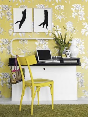
I hope this helps if you are looking for advice on nursery essentials. Of course, these are just my opinions and will mostly help if your budget is very tight, like ours was. You’re not a bad parent if you don’t spend a fortune on your baby’s nursery and it’s important to remember that. In terms of design, there are lots of ways to be creative. There is a fantastic blog, Chic & Cheap, which showcases some brilliant nurseries which have been done on minimal budgets and they’re really inspiring.
How have you decided to decorate your little one’s nursery? I’d love to hear from you if you think your nursery is worth sharing!
Mx

Monday 9 January 2012

Weekly Inspiration #1

One of my New Year's Resolutions was to broaden my blog posts in 2012 and post more regularly. So, in what can only be described as a blatant copying off one of my favourite blogs, Elegant Musings, I have decided to post a weekly (!) inspirational post showing the things on the web which have caught my beedy eye this week, as well as anything which is particuarly influencing my current tastes, be it a newspaper article, upcoming event or film which i've recently watched.

This week, I'm feeling the vintage vibe. I'm looking at our kitchen and none-existant dining area and mulling over the possibilites. The space restrictions have lead me to look at making a boothed seating area, a la the 1950s. Also, i've been looking at vintage pieces for our master bedroom to dress the room. Finally, I saw the film, Revolutionary Road, earlier this week and spent the whole film drooling over the decor, so i've been googling that a fair bit too.

What's been catching your eye this week?
M x

Friday 6 January 2012

HOME IMPROVEMENT: Master Bedroom


We’ve been in our new abode for a little over a month now, and I’m disappointed with myself that it hasn’t all been completely converted to reflect my tastes. But, as keen as I am to transform this place into my dream home, there have been a few things hindering the process: Christmas for one thing, and my daughter for another. Before motherhood, I saw my maternity leave as a wonderful, restful place where I could finally focus on completing my dream of writing a childrens book, improve my sewing ability and explore new and exciting recipes in the kitchen, and of course redecorate our new house. But as it turns out, children need nurturing. They need entertaining and you really need to keep your attention focused on them. Hmmm. So I’m now just three weeks away from returning to work (albeit part time) and have achieved none of the above. Hmpf.

But it hasn’t all been dirty nappies and bottle feeds this past month. I did manage to make chutneys and pickled onions for Christmas gifts, as well as mince pies and Christmas cake. And in the very miniscule amount of spare time I had, I painted our new Master Bedroom. Hurrah! And what wonderful scheme have I gone with, I hear you ask? Well, it’s all very exciting. The room was painted BRILLIANT WHITE (gasp) which in my opinion, really should only be used in rooms with immaculately plastered walls and excellent light. Our room does not have these things – it has textured wallpaper (double gasp) which I despise. I could have stripped the walls, or have applied Polycell filler everywhere but I didn’t. I’ve just painted on top, but I’ve managed to achieve a much better finish by opting for matt paint as this doesn’t highlight the texture as a silk paint would. And the colour of the newly painted walls is (drumroll please)….. CONTEMPORARY. Oh, that’s not a colour? Well, it’s what it says on the tin. It’s actually the colour of Double Cream. Yes, that’s right – its off-white. Haha! A whole month and I’ve transformed the room from BRILLIANT WHITE to OFF WHITE. But it looks much better, I swear! I’ve also covered up the feature wallpaper which was had a floral vine design on in black and blue-grey.

Now the canvas is restored to a more aesthetically pleasing neutral tone, the room is looking much bigger and lighter. The textured wallpaper, though still present, is not nearly as noticeable. I’ve recycled the curtains from our old house’s living room (as curtains can be a costly affair for good quality and we simply can’t afford that at the moment) and have been hunting for an appropriate light fitting. The new bed has arrived (hurrah) and the wardrobe is on its way. When the main furniture is all in situ, I’ve got to start looking at dressing the room which I’m in two minds over. For the moment, I’ve just used bits we already had and I’m not very happy with the overall look at all.

The curtains are a green/yellow leafy design on an ivory shimmer background, They aren’t my first choice for bedroom curtains really – like I said they were in our living room. And with duel aspect windows, they affect the feel of the room quite a lot. And unfortunately, they don’t fit in with either of the schemes I had in mind. I had been toying very indecisively between a Kelly Hoppen inspired room of very sophisticated taupe and grey and a desperate housewives Susan Mayer style room of a more country, homey feel. I’m not decided yet. But then I came across an article on vintage bedrooms with reconditioned antique finds and REALLY liked the look. So I’m going to sit on it until the robe arrives and decide then. At the moment, vintage is winning out, but it depends on how I feel tomorrow. Hmmm.
So, here for your viewing pleasure are some snapshots of the room at the moment. I will of course post a Completed Room post at a later date, so bets are being taken on which design route we decide to go down.
Related Posts Plugin for WordPress, Blogger...