

If you’re considering a neutral colour palette for a room, the paint colour which immediately springs to most people’s mind is the great British painter’s staple: Magnolia. But there are various different ways to approach a neutral colour palette.
If you ask an Architect to pick a neutral paint colour for a design, the answer will invariably be White. Brilliant White. This is because white highlights Architectural designs without distracting. White looks lovely on smooth plastered walls and it helps people notice the building design and room proportions: exactly the parts which an Architect is most proud of.
If you ask an Interior Designer to select a neutral paint colour, they’ll offer you anything but white. Taupe, Dove Grey, Camel, Pebble, Mink – just to name a few. Often, these will be from the darker end of the neutral scale – used to create intimate spaces with light pockets and dark corners. This removes the boundaries of a room, making the actual proportions less noticeable and therefore highlighting the room content.

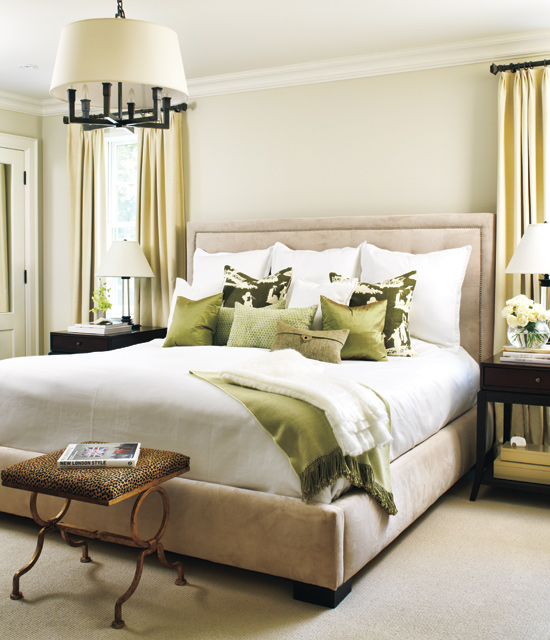
I’ve selected a few choice images of neutral bedroom schemes from both ends of the neutral scale – from light airy beige through to deep earthy browns. You'll notice the paler palettes use darker tones or patterns as a feature, whereas the dark rooms use punches of light to frame or enhance the details.


So... which colour will you be painting your room? Are you a fan of the classic Magnolia, or would you prefer a dove grey backdrop, we'd love to know!
Mx