Saturday, 18 February 2012

Designer Focus: Vivienne Westwood

It’s fair to say that Vivienne Westwood fashion is unique. You certainly wouldn’t confuse it with being, say, Armani or Paul Smith. It is iconic of the British Punk era of the 1970s, with strong Patriotic statements and Festish inspired accessories – it’s difficult to think of Westwood without simultaneously imagining Johnny Rotten and the Sex Pistols. And the same ethos has been implemented to her dabbling in the Interior world, creating edgy Punk inspired pieces to inject some mischief into the home. In conjunction with Cole & Son Wallpapers and The Rug Company, Westwood has created a small selection of Punk items – so here a just a few.

The rugs are great – real statement pieces which strike a political point as well as a fashionable one. Unfortunately, the prices are about as far away from the grass roots of Punk Fashion as you could imagine, but that’s fashion for you. This is Interior Design for Rock Stars as you’d be pushed to afford any on a normal income.

The wallpapers are by far more affordable and can have an equally dramatic impact on a room. Teaming any of these designs with traditional furniture (think worn leather wingback chairs) and you’re onto a winning Punk look.

Tuesday, 14 February 2012

Weekly Inspiration #3


Well – I think it’s fair to say I’ve failed miserably on my New Year’s resolution to post a weekly inspiration montage, considering it’s the 14th February and I’ve only just posted my 3rd one! Oops. Bi-weekly is perhaps more accurate, but that doesn’t have quite the same ring to it does it?!
This past week or so, I’ve been feeling all Loved Up. Yes folks, it’s Valentine’s day and Love is All Around. So I’ve been looking at romantic images – you know the sort – rose petal scattered beds, candlelit dinners and open fires. But I’ve also gone a little abstract as well: writing desks are such a romantic piece of furniture don’t you think? Long before email and instant messaging, Writing Desks were privy to all our romantic musings. I’d like to think that people still write – pen to paper – and commit their feelings with ink. Never had a love letter yet, but I’m still young… Also, I’m still perusing the web for new bedding with our second bedroom in mind, and looking for an inspiring colour palette too.
What’s got your design juices flowing this Valentines week…?

Sunday, 12 February 2012

Get the Look: DESPERATE HOUSEWIVES RENEE


As the vixen on Wisteria Lane with boodles of cash and the co-founder of an Interior Design company to boot, Renee’s Bedroom had to be really impressive to match the character. And it is. In fact, the whole house (formerly home to Edie Britt before her untimely demise) is decked out in some fabulous interior wares. Needless to say, there are a few designer labels dotted about the place. This last season has given us some great shots of Renee’s home, from her textured wall on the stairwell to the uber modern kitchen. I managed to capture a few screenshots of the bedroom and have compiled a little moodboard for anyone looking to create a Renee style boudoir.

The bedding I tracked down at Macy’s and is currently on offer. The bronze tones are complimented by the mocha wallcolour. Combined with splashes on Turquoise, the milky brown is then subdued with white furniture. Though I couldn’t locate the exact pieces used on the show (I’m not from the states and have limited knowledge of their interior industry) I did find some suitable pieces by Italian designer SMA – available at various stockists around Europe. Top it all off with a velvet upholstered Chaise Longue with scroll top detail and you’re onto a winner. The must have piece is the upholstered bed – I found a good match at High Fashion Home – with a high headboard, deep button detailing and winged sides.

Happy shopping!
Mx

Saturday, 11 February 2012

NURSERY RHYMES: photo showcase


This is really more of a "story so far" kind of post. Its significantly nicer than the original room with its plain magnolia walls and beige carpet, but its not quite there yet. I have many things I plan on implementing over the coming months, for instance:
  • Tissue Paper Pom Poms are a must - the ceiling height looks vast at the moment and for a box room, it needs bringing down a little bit visually, so pom pom clouds should do the trick.
  • Silver Birch stump Table - currently, i have an old bedside unit with a wicker drawer in which solves some minor storage issues and gives me a place for the baby monitor to sit, but I'd love a little tree stump instead to complete the woodland theme. Fortunately, I have a friend who is a Tree Surgeon so he's keeping his beady eyes peeled for me.
  • Wardrobe - we got this bargain from Argos. the reason its a bargain is because its unfinished. As the cot is second hand and a varnished pine, it would make sense to varnish this too - but i don't like that idea. So i do plan on painting it white, when my daughter has outgrown her cot. So, in about 3 years.

There are also a few pieces just to dress the room I'm looking for, and I'm sure these will pop into my peripheral vision at some point. Anyway, hope you like the photos!

Mx

Wednesday, 1 February 2012

HOME IMPROVEMENT: Master Bedroom Photo Showcase


So, its not quite complete just yet, but the room is finally coming together. To summarise the scheme so far:
  • The walls have been re-neutralised to a "contemporary" off white with splashes of lime/mint and chocolate.
  • Curtains are a recycled feature of our old living room, by Montgomery
  • The Bedstead is the Leamington by Next
  • Throw from (*shocked face*) Sainsburys
  • Bedding from Next
  • Wardrobe by Argos
  • Bedsides & Chest Of Drawers by Ikea
A lot of our bits and pieces are not new, as we've lived together for almost 8 years now and have acquired things along the way. But the two large pieces (bed & wardrobe) have been bought with longevity in mind and we searched around for the bargains.


The room is not completely dressed yet. I'd like to really make a feature of the bedding and am considering buying some egyptian cotton of a good quality high thread count (600 if i'm lucky). Also, when money is not such a deciding factor, i'd like to incorporate a stunning wallpaper, like the "Elementi Fiamma" by Zoffany. This would look amazing with the zesty greens already used.

Tuesday, 31 January 2012

Neutral Colour Palettes: DARK vs LIGHT


If you’re considering a neutral colour palette for a room, the paint colour which immediately springs to most people’s mind is the great British painter’s staple: Magnolia. But there are various different ways to approach a neutral colour palette.
If you ask an Architect to pick a neutral paint colour for a design, the answer will invariably be White. Brilliant White. This is because white highlights Architectural designs without distracting. White looks lovely on smooth plastered walls and it helps people notice the building design and room proportions: exactly the parts which an Architect is most proud of.
If you ask an Interior Designer to select a neutral paint colour, they’ll offer you anything but white. Taupe, Dove Grey, Camel, Pebble, Mink – just to name a few. Often, these will be from the darker end of the neutral scale – used to create intimate spaces with light pockets and dark corners. This removes the boundaries of a room, making the actual proportions less noticeable and therefore highlighting the room content.

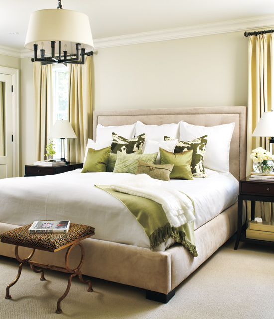
I’ve selected a few choice images of neutral bedroom schemes from both ends of the neutral scale – from light airy beige through to deep earthy browns. You'll notice the paler palettes use darker tones or patterns as a feature, whereas the dark rooms use punches of light to frame or enhance the details.

I think that ultimately, the darker the palette, the more sophisticated the overall look becomes. Is this because we grown ups maybe don't like how things look in the harsh light of day? Perhaps! But also, a darker palette conceals a multitude of sins and therefore stands a better chance of creating a pleasing result.


So... which colour will you be painting your room? Are you a fan of the classic Magnolia, or would you prefer a dove grey backdrop, we'd love to know!
Mx

Wednesday, 25 January 2012

DESIGNER FOCUS: Orla Kiely

She’s become such a success of recent years, chances are you’ve come across Orla Kiely designs in numerous forms. Her fashion line is right up my street – 50’s and 60’s revival, using textured fabrics and retro proportions and cuts to create timeless designs. Her homeware products bend a little bit more towards the 50’s I think, using nature to inspire geometric patterns and neat colour palettes. The most common design I’m aware of is the multi coloured stem print design which has been transferred onto a wealth of merchandise from Radios to cushions to mugs.

Here are a few of my favourite images showing her Interior items. I’m loving the wallpaper in the kitchens but sadly I cannot afford £62 a roll… but if you can, then Heals is the place to go. But I bet there are a few copycat designs available – I shall be perusing Graham & Brown later to see if I can find one for my own home. Also, check out the fab “carpark” duvet covers, currently on sale at Dotmaison.com – I just love the simplicity.
Related Posts Plugin for WordPress, Blogger...