Showing posts with label paint colour. Show all posts

Wednesday, 22 February 2012

Colour Wheel: OLIVE GREEN

This is a new type of post I’m trying out. Basically, I plan on selecting a colour and creating a little bedroom scheme around it. This week, I’ve opted for Olive Green.

For paint, I’ve picked Olive by Farrow & Ball – it has a little bit more pigment than Lichen but isn’t as overpowering as a lime would be. Green is also a great basic colour to work alongside dark woods – I’ve shown it here with Walnut Engineered flooring though Thermo Fumed Oak would work just as well. In the furniture, I’ve mixed walnut and wenge – I find that with wood its often good to mix, especially when the wood is darker in tone. This gives more depth to a scheme and helps create highlights. I’ve used walnut and wenge combinations many times and really like the overall effect.
To complete the palette, I’ve teamed the Olive with a rich Dark Chocolate and Mink, with white linen bedding and a selection of green shaded scatter cushions. I love the chair as it gives a nice strong statement – very masculine – and opted for a feature pendant light to add interest.

Though I haven’t used any in the visual I’ve drawn up, there are some nice wallpapers which would work with this palette. Here are a couple from Graham and Brown – I particularly like the Brown “Jazz” swirls which add a little feminine touch.
Have you used Olive in your bedroom? If so, what colours did you mix it with?
Mx

Tuesday, 31 January 2012

Neutral Colour Palettes: DARK vs LIGHT


If you’re considering a neutral colour palette for a room, the paint colour which immediately springs to most people’s mind is the great British painter’s staple: Magnolia. But there are various different ways to approach a neutral colour palette.
If you ask an Architect to pick a neutral paint colour for a design, the answer will invariably be White. Brilliant White. This is because white highlights Architectural designs without distracting. White looks lovely on smooth plastered walls and it helps people notice the building design and room proportions: exactly the parts which an Architect is most proud of.
If you ask an Interior Designer to select a neutral paint colour, they’ll offer you anything but white. Taupe, Dove Grey, Camel, Pebble, Mink – just to name a few. Often, these will be from the darker end of the neutral scale – used to create intimate spaces with light pockets and dark corners. This removes the boundaries of a room, making the actual proportions less noticeable and therefore highlighting the room content.

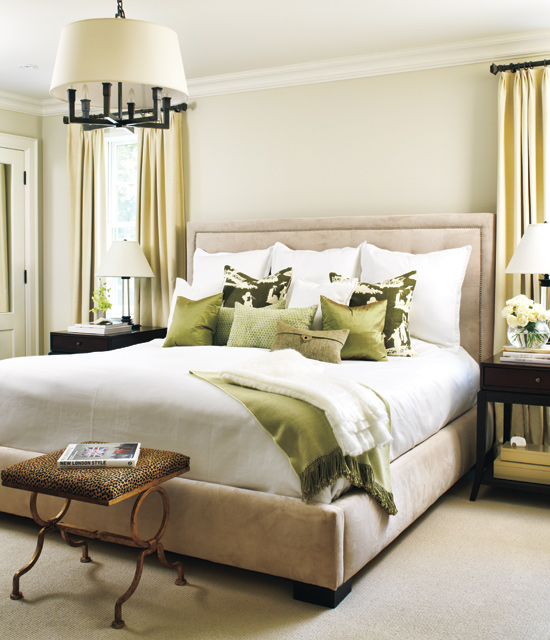
I’ve selected a few choice images of neutral bedroom schemes from both ends of the neutral scale – from light airy beige through to deep earthy browns. You'll notice the paler palettes use darker tones or patterns as a feature, whereas the dark rooms use punches of light to frame or enhance the details.

I think that ultimately, the darker the palette, the more sophisticated the overall look becomes. Is this because we grown ups maybe don't like how things look in the harsh light of day? Perhaps! But also, a darker palette conceals a multitude of sins and therefore stands a better chance of creating a pleasing result.


So... which colour will you be painting your room? Are you a fan of the classic Magnolia, or would you prefer a dove grey backdrop, we'd love to know!
Mx
Related Posts Plugin for WordPress, Blogger...