Showing posts with label Movies. Show all posts

Wednesday, 7 March 2012

His & Hers: The Future of Bedroom Design?

I was watching UP the other day (of course, my 9 month old daughter was watching it and I just happened to glance at the TV while doing housework. Yeah right) and just after the heart-breaking story of Ellie’s death, we see Carl Fredricksen sitting in his bed. It’s a sad little scene: Old Carl, grumpy face, clearly sitting on his side of the bed; Another day without his wife, sob. And in this momentary view, we see a teeny tiny insight into their love.
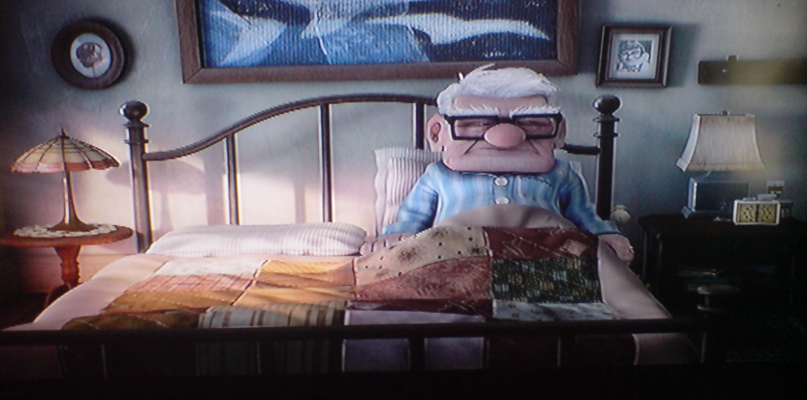
So many stories focus on the beginning of love: the exciting part where it’s all lust and passion and “I can’t live without you” and “I must have you now”. We’ve all been there. But few stories look at love in the real sense: the part beyond the throws of passion, beyond the marriage proposal, wedding and honeymoon period. This is day to day love – the boring kind. But look into your grandparents eyes, and that’s what they have. That’s what we all want, really. And that’s what Karl and Ellie had.

So, how did they survive a lifetime together? What was their secret? We’re shown how they were total polar opposites from the moment they met: Carl the quiet type, with a passion for the mechanics of the world and with a rather square face; Ellie with her bold personality, passion, love of adventure and Oval face. But they share a single dream: to travel to South America. That’s like America, but South. I think the answer is simple: They are two halves of the same whole. Ying and Yang, slotting together to make a compete piece. Carl brings the stability Ellie needs, and Ellie provides the excitement. It’s a mutual, equal relationship.
Anybody who has been in a relationship for a long time will tell you it’s about Compromise. So, when it comes to the Bedroom (and I mean Bedroom Design of course), should there be compromise here too? Design can easily sway to the Feminine or Masculine. Shabby Chic = Feminine. Urban Modern = Masculine. But can the two exist together? Compromise says yes, as long as they complement one another. And no, I’m not saying that shabby-chic-urban-modern is a new upcoming trend that you should watch out for, because that’s just silly.

So, I’ve drawn together a little “his and hers” bedroom scheme. I’ve opted for a monochromatic palette (neither male nor female as a rule) and have allocated the black to the feminine and white to the masculine side (which is maybe a little unconventional). I think by using simplistic furniture with some feminine detailing for the female side and dynamic, solid pieces for the male, a real fusion can be achieved. And I’ve done it all on super bargain budget as 90% of the items are available from Ikea!
Have you achieved a perfect unity of male and female in your bedroom design? If so, we’d love to hear how!

Tuesday, 20 December 2011

Get The Look: HOME ALONE for the Festive Season


Now most of us like to put up a tree at Christmas, drape every available surface in tinsel or maybe place a festive wreath on the front door. Some go to the extra hassle of adorning their whole home exterior in Christmas lights. But few of us coordinate our whole Interior for the festive season.
The 1990’s genius film, Home Alone, however shows us just how, if we ever chose to do so, a Festive Interior can be achieved. With a rich Berry Red and Holly Green colour scheme running throughout the entire house, the house oozes Festive cheer. It makes me want to crack open the Advocaat and Lemonade just looking at it. Quite a design choice for a family who chooses to spend Christmas anywhere but in their home. Hmmm.
Anyway, taking the Festive cheer of Home Alone and looking at the Master Bedroom in particular (the location for the pivotal scene and exclamation “We slept In!!” which kick-starts a mad rush to the airport) I’ve had a little try and creating a very merry bedroom scheme. If you’re a Christmas nut (haha) then maybe this is for you. It’s not for the faint hearted and a liking of red is a must.

Of course, as the film was made a whopping 20 years ago now, a like for like scheme isn’t very easy to achieve so excuse the poor substitutions for some items. However, the overall look still takes inspiration from the film. The items could be acquired from the following suppliers:
·         Cherry Blossom wallpaper by Graham & Brown
·         Four Poster Bed by Stokers
·         Antionette Bedside by Willis & Gambier
·         Rug by The Rug Company
·         Bedside Lamp by Graham & Green
·         Red Bedding by Debenhams
Do you have any items which you think would complete the festive scheme? Or is there another Crimbo Film which has a fabulous Festive cheery interior? For me, Home Alone is my Christmas guilty pleasure without a doubt! MERRY CHRISTMAS!!!!!!!!

Sunday, 20 November 2011

Grease is the Word: Get the Look


I think that for a generation of teen girls, Grease really was the word. There are few girls who haven’t donned black leggings and a pink satin jacket with the words “pink ladies” emblazoned across the back for a girls’ night out or fancy dress party.  The iconic film with its catchy songs and risqué tale of teen love continues to spawn new fans and romanticises 1950’s America, making us all wish that, despite its lack of internet and sky TV, we had been lucky enough to have been born in the era where a circle skirt was compulsory attire and school looked (almost) fun. But are today’s teenagers still as gripped by the film as we were? Or will the sight of Pink Ladies on a hen do disappear in years to come? No – I think it has a longevity which most films and musicals can only dream of. So, why am I, a self-confessed interiors addict, talking about films and fashion? To help any Pink Lady wannabes out there recreate a true Pink Lady bedroom of course, with a nod the 1978 classic film.

If we look at a screenshot of the movie during Rizzo’s rendition of “look at me I’m Sandra Dee” , we get a great snippet of Marty’s bedroom. Are we surprised the room is mostly Pink and Black? Not really.  Are we surprised that there are pictures of 1950’s heart throbs pinned to the wall above her bed? Nope. And who wouldn’t have wanted to have such a cool bedroom as a teenager? I know I would have killed for my own en suite “powder room” that’s for sure. I’ve searched the web for furniture currently on the market which could help achieve a Pink Lady bedroom with inspiration drawn from Marty’s room.

To begin, the wallpaper in the film is a vintage coral pink swan design and there are a couple of options available for this: the Flamingo design by Cole and Son (£55 a roll) or Swan Lake by Nina Campbell (£52 a roll) both available from Wallpaper Direct. Use this in moderation like Marty, as a Feature Bedhead wall.
Accessorise: Marty is a real man eater and clearly a fan of Elvis and James Dean. If old 50’s heart throbs aren’t your thing though, how about using black and white photos of your own teen crush instead? But I’ve got to say, who wouldn’t have drooled over James Dean in this picture? Marty also shows her arty side with her half-finished Paint By Number’s Horse picture and a patriotic token Rydell High banner in red.

Furniture: Marty’s room is nice and girly on the colour side but has some fairly plain and simple furniture, much in-keeping with the era. The Ikea Brimnes bed with its headboard storage is ideal for a teenager’s room and matching simple bedsides and chest of drawers to complete the basics. Marty also has a deco style dressing table with marble effect top and vanity mirror –but I love this 1950’s style one available from Bouf.com.

Her bedding sticks with the pink and black colour scheme, much like this vintage 50’s fabric with lighting in the form of a tripod standard lamp and simple bedside light. Finally, finish the room with a weave chair like this one available from utilty – a classic 50’s design.

Is there anything else which you think should go in a Pink Lady bedroom? Feel free to leave comments and links below,
Oh, I forgot about the wall colour! in the words of Rizzo: Peachy Cream.

Thursday, 3 November 2011

Achieving a Titanic Interior: get the look for 2012

With 2012 marking a century since the tragic sinking of the RMS Titanic, many eyes are looking fondly back through design archives, looking to re-acquire the magic of Titanic. The White star Line giant was constructed primarily in the shipyards of Belfast, Ireland and housed some of the most spectacular interiors in history. Itself taking influences from many design eras including Jacobean, Louis XVI, Louis XV, Georgian and Queen Anne, the Titanic style is now becoming a hot trend for Interiors of 2012. Though achieving the magnificence of Titanic to a smaller budget and within the limitations of a family home may seem somewhat daunting, it is none the less achievable.
The key to taking inspiration from historical influences is not to create a replica of the style, but to take flavours of the era and fuse these with more contemporary elements. To cover your 8ft x 10ft dining room in wall to wall, floor to ceiling mahogany panelling with hand carved detailing in homage to the first class smoking room would not work. But taking the principles of the colour palette, displaying a print from the era or opting for a titanic inspired lighting theme may be more successful.
As always, I’m looking at bringing a little Titanic glory into the bedroom design. For anybody who has seen the 1997 blockbuster of the ships sinking, you may remember the labyrinth of rooms which Rose and Hal occupied on the maiden voyage. I think the film portrays a fairly accurate example of first class accommodation and its worth examining for inspiration.

Though many of Titanic’s rooms were panelled to recreate opulent stately home-style décor, this is not really practical for modern home design as most homes don’t have rooms of the correct dimensions to allow this to work. But achieving a panelled look can be easily achieved by applying MDF panels and dado detailing to a single wall. Rather than dominating the space in a Mahogany stain, opt for a more neutral colour like Taupe or Stone. This way, you are adding architectural detailing without distracting from other elements. Keep it simple and make the panelling proportionate to the room, with simplistic moulding rather than an over embellished cornice.
Wallpaper was a real luxury of the early 20th century and some designs are being revampted for the modern market. Little Greene have some reproduction wallpaper prints which have been tweaked but are heavily based on original designs. The 1915 Marlborough design is a few years late for Titanic but certainly contains the right elements. Alternatively, the Rococco design by Cole & Son would work perfectly. Again, I prefer the muted greys, taupe and cream designs where the pattern design is subtle as I find the design is more impressive when subdued.
Lighting is another key element – spotlights & halogens are a no go on this one – instead look for creating a more intimate lighting scheme to create a quiet romantic air. For a contemporary take, use low hung pendant lighting for bedside illumination rather than table lamps, keeping your nightstand free and uncluttered.
Finally onto the Furniture and accessories: I think that if you have kept with a fairly neutral colour scheme up to now, opting for richer furniture and bold colours will pay off to complete the titanic vibe. Don’t be afraid to mix styles – the more dramatic the better. Graham & Green have lots of gorgeous pieces which take inspiration from early 20th Century design. If you’re after detailed dark wood items, Stokers are also a good place to look for Bedsteads and Nightstands with a huge selection to choose from. In Accessories and staging, I love the idea of having three staggered mirrors like these Lucille Mirrors – they’re decorative and have an eclectic vibe and I can imagine being dolled up in full Dinner Attire and using these to get the full 360 of an outfit.
So there you go – Titanic style in bite sized pieces. Here is my take on using titanic influence within bedroom design, hope you like!
M x

Saturday, 20 August 2011

Harry Potter and the House that Magic Made


I LOVE Harry Potter, and am totally amazed that it was all dreamed up by one mind. And, as per usual, I often find myself inspired by a particular scene or location. It's not always Harry Potter – films and books of all walks seem to influence me – but I do think this magical world is particularly inspiring.

So, should you too feel inspired by the Harry Potter Universe and want to indulge in a little fantasy interior, here are a few items available on the high street to help you on your way.


Thinking about trawling the Hogwarts library in search of Nicolas Flamel? There's a whole world of Library themed wallpapers which have been in vogue since about 2005 and are still going strong. This one is available from Andrew Martin is very Potteresque.


Remember the case which Mad Eye is kept captive in during Harry Potter and the Goblet of Fire? This piece by Antropologie really fits the bill. And this Rug from The Rug Company could easily have resided in the Griffindor Common Room.

And what Harry Potter interior is complete without the token Chesterfield?


And finally, if you really want to splash the cash to go all-out-castle-interior, this Wall Tapestry surely is a must have.


Saturday, 6 August 2011

REPLICATE THE MOVIES: Sex and the City


Ever watched a film and thought "I'd love to live in a place like that"? Of course you have: that's why companies pay so much to have their products featured in films. I think a lot of people assume this Product Placement is mainly used by companies like Coke Cola and Pepsi, where the main character is seen sipping from a cup with a giant logo plastered across it and strategically placed facing the camera. But often I find myself drawn to the background, the scenery and the home accessories. So, I've decided to explore some films and really try to locate the products so you can try to recreate them in your own home. I decide to go firstly with the chick flicks; Sex and The City 1 & 2.

SEX & THE CITY… it's all about designer

Considering the series focused so much on designer clothing, it's not surprising that when they decided to bring it to the Big Screen, they thought to revamp the (let's admit it) drab interiors. And, no surprise at all that they decided instead to clad every surface in designer wares. Fortunately, the world of interior design has nowhere near as many designer brands and items as the world of fashion, so finding the exact items isn't too difficult… affording them is a little harder!

 
CARRIES "GROWN UP" APARTMENT
Onto Sex and the City 2 (which is dire – seriously, don't bother watching this as it has absolutely no plot whatsoever) we see Carrie and Big in their marital home and instead get a design fusion of Carrie's Fashionista flair and Big's New York Banker style. Again, throw in multiple designer labels, vintage pieces and a price-tag that'll give you a heart attack, and BOOM, you've got it. I particularly like this colour palette I have to say – the masculine taupe with splashes of a feminine pink and blue really appeals to me.


CARRIE AND BIG'S APARTMENT
If I had to pick one, I think I'd opt for Carrie's apartment from the first film. I love the bold splash of colour and even though it's deemed the "grown up" version of Carrie's apartment, it's still young and fresh. Their marital home is very adult, and as much as I do like it, I certainly couldn't live in it as it's far too conservative for my tastes.


Related Posts Plugin for WordPress, Blogger...