Showing posts with label Bedroom. Show all posts

Wednesday, 28 March 2012

Canary Yellow with a 50s Vibe

Firstly, let me apologise for my absence of late. Many things have kept me distracted. Firstly, my long time boyfriend finally proposed after 10 years (!) of “courting”. As you can imagine, I have 10 years build-up of marriage related ideas which I had to explore immediately. This has lead me to look into designing my own wedding stationary and has developed into a little business idea. So, with daydreaming of weddings and my possible business venture (which shall remain an idea for a little while longer I imagine, if ever becomes anything more) I have not thought about anything remotely interior design based which would be worth noting on here. Add to that, my daughter is at a rather interesting age (10 months now, blimey its gone fast) and is trying her level best to walk. This is causing me to be both physically and mentally exhausted come the evening, when I usually dedicate my spare time to The Blog.


 BUT, did you notice spring has suddenly arrived?! Yes folks, spring is officially here and the fresh spring light has shined through my windows and into my humble home… which is still in need of decorating. And in true spring-cleaning like gusto, I’m back on the case and keen to get cracking again.
One room which has not been touched yet is our Spare Bedroom. For a long time, in fact since we moved it, it has been a junk room. All the stuff which we’d acquired in our old house and didn’t have a place for has been piled up and I had mentally closed the door to the issue. Temporarily. But with lovely weather and that burst of energy that seems to come with spring, I’ve managed to clear most of it away. So, now to the fun part: getting a moodboard together.
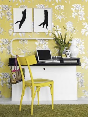
I’m LOVING yellow at the moment – not sure if I’m a couple of years behind a trend here or too trendy for my own good, but there is not a vast amount of yellow currently on our high streets. Green, yes. Teal, yes. Red, yes. Yellow… not so much. But it’s such a gorgeous colour in my opinion, so fresh and gender-neutral, I’m really keen to use it in our Guest Bedroom. I’m also looking for a little bit of a quirky edge on it too, and would love to incorporate a 50’s vibe. So, for the time being, I’ve done a little sketch and am working on a moodboard. Most of our furniture will be second hand here, so I want to pull it all together by making bold statements of Black, White and Yellow. Its gona be great… trust me, I’m a designer.

Mx

Saturday, 3 March 2012

Inspired by Fashion: Kendi's Buildings & Books

I've said it before and I'll say it again: Interiors follow Fashion. By fashion, I mean those rags you casually throw on every morning without second thought. Or rather, I mean it follows the fashion of those folks who do give a second thought to their daily attire, and in fact give rather more than just a second thought - they give a third and fourth thought too I imagine.

Sadly, I am not one of these people. Though I am quite capable of appreciating a good outfit, I am not and have never been, a fashionable trend setter type person. I am at best a distant admirer of fashion. I'm aware its there. And I do follow a couple of fashion blogs - one of which has given me a swell idea for an ongoing series of posts.

If you are not aware of its existence, I recommend you hop along to Kendi Everyday - a fashion blog which focuses on the fashion of one young trend setter in Dallas. Not every day, but almost, she uploads some snapshots of her outfit for the day with a few choice words and makes it look incredibly easy. And though I know that those great outfits will not look anything like that on me (having not been blessed with a model-like physique) the colours, fabrics and patterns do inspire me.

So, in a round about way, I'm trying to tell you about my new post idea. I shall compose a little interior scheme around an outfit which had been caught in my peripheral vision and has thus inspired me. Hence, Inspired By Fashion. And, to kick start this all of, I have selected this outfit showcased by Kendi last week.


The colour palette is dark - rich warm browns and black. The outfit incorporates contrasting fabrics: leather boots repesented above in the chair, and a sheer blouse represented above by the soft voile window treatment. The wallpaper options pick out the pattern detail and are both available from Cole & Son. The overall look Kendi achived looked smart, yet comfortable, so i've tried to reflect that here with non-fussy furniture with soft detailing.

So... what do you think? x

Wednesday, 22 February 2012

Colour Wheel: OLIVE GREEN

This is a new type of post I’m trying out. Basically, I plan on selecting a colour and creating a little bedroom scheme around it. This week, I’ve opted for Olive Green.

For paint, I’ve picked Olive by Farrow & Ball – it has a little bit more pigment than Lichen but isn’t as overpowering as a lime would be. Green is also a great basic colour to work alongside dark woods – I’ve shown it here with Walnut Engineered flooring though Thermo Fumed Oak would work just as well. In the furniture, I’ve mixed walnut and wenge – I find that with wood its often good to mix, especially when the wood is darker in tone. This gives more depth to a scheme and helps create highlights. I’ve used walnut and wenge combinations many times and really like the overall effect.
To complete the palette, I’ve teamed the Olive with a rich Dark Chocolate and Mink, with white linen bedding and a selection of green shaded scatter cushions. I love the chair as it gives a nice strong statement – very masculine – and opted for a feature pendant light to add interest.

Though I haven’t used any in the visual I’ve drawn up, there are some nice wallpapers which would work with this palette. Here are a couple from Graham and Brown – I particularly like the Brown “Jazz” swirls which add a little feminine touch.
Have you used Olive in your bedroom? If so, what colours did you mix it with?
Mx

Sunday, 12 February 2012

Get the Look: DESPERATE HOUSEWIVES RENEE


As the vixen on Wisteria Lane with boodles of cash and the co-founder of an Interior Design company to boot, Renee’s Bedroom had to be really impressive to match the character. And it is. In fact, the whole house (formerly home to Edie Britt before her untimely demise) is decked out in some fabulous interior wares. Needless to say, there are a few designer labels dotted about the place. This last season has given us some great shots of Renee’s home, from her textured wall on the stairwell to the uber modern kitchen. I managed to capture a few screenshots of the bedroom and have compiled a little moodboard for anyone looking to create a Renee style boudoir.

The bedding I tracked down at Macy’s and is currently on offer. The bronze tones are complimented by the mocha wallcolour. Combined with splashes on Turquoise, the milky brown is then subdued with white furniture. Though I couldn’t locate the exact pieces used on the show (I’m not from the states and have limited knowledge of their interior industry) I did find some suitable pieces by Italian designer SMA – available at various stockists around Europe. Top it all off with a velvet upholstered Chaise Longue with scroll top detail and you’re onto a winner. The must have piece is the upholstered bed – I found a good match at High Fashion Home – with a high headboard, deep button detailing and winged sides.

Happy shopping!
Mx

Saturday, 11 February 2012

NURSERY RHYMES: photo showcase


This is really more of a "story so far" kind of post. Its significantly nicer than the original room with its plain magnolia walls and beige carpet, but its not quite there yet. I have many things I plan on implementing over the coming months, for instance:
  • Tissue Paper Pom Poms are a must - the ceiling height looks vast at the moment and for a box room, it needs bringing down a little bit visually, so pom pom clouds should do the trick.
  • Silver Birch stump Table - currently, i have an old bedside unit with a wicker drawer in which solves some minor storage issues and gives me a place for the baby monitor to sit, but I'd love a little tree stump instead to complete the woodland theme. Fortunately, I have a friend who is a Tree Surgeon so he's keeping his beady eyes peeled for me.
  • Wardrobe - we got this bargain from Argos. the reason its a bargain is because its unfinished. As the cot is second hand and a varnished pine, it would make sense to varnish this too - but i don't like that idea. So i do plan on painting it white, when my daughter has outgrown her cot. So, in about 3 years.

There are also a few pieces just to dress the room I'm looking for, and I'm sure these will pop into my peripheral vision at some point. Anyway, hope you like the photos!

Mx

Wednesday, 1 February 2012

HOME IMPROVEMENT: Master Bedroom Photo Showcase


So, its not quite complete just yet, but the room is finally coming together. To summarise the scheme so far:
  • The walls have been re-neutralised to a "contemporary" off white with splashes of lime/mint and chocolate.
  • Curtains are a recycled feature of our old living room, by Montgomery
  • The Bedstead is the Leamington by Next
  • Throw from (*shocked face*) Sainsburys
  • Bedding from Next
  • Wardrobe by Argos
  • Bedsides & Chest Of Drawers by Ikea
A lot of our bits and pieces are not new, as we've lived together for almost 8 years now and have acquired things along the way. But the two large pieces (bed & wardrobe) have been bought with longevity in mind and we searched around for the bargains.


The room is not completely dressed yet. I'd like to really make a feature of the bedding and am considering buying some egyptian cotton of a good quality high thread count (600 if i'm lucky). Also, when money is not such a deciding factor, i'd like to incorporate a stunning wallpaper, like the "Elementi Fiamma" by Zoffany. This would look amazing with the zesty greens already used.

Friday, 6 January 2012

HOME IMPROVEMENT: Master Bedroom


We’ve been in our new abode for a little over a month now, and I’m disappointed with myself that it hasn’t all been completely converted to reflect my tastes. But, as keen as I am to transform this place into my dream home, there have been a few things hindering the process: Christmas for one thing, and my daughter for another. Before motherhood, I saw my maternity leave as a wonderful, restful place where I could finally focus on completing my dream of writing a childrens book, improve my sewing ability and explore new and exciting recipes in the kitchen, and of course redecorate our new house. But as it turns out, children need nurturing. They need entertaining and you really need to keep your attention focused on them. Hmmm. So I’m now just three weeks away from returning to work (albeit part time) and have achieved none of the above. Hmpf.

But it hasn’t all been dirty nappies and bottle feeds this past month. I did manage to make chutneys and pickled onions for Christmas gifts, as well as mince pies and Christmas cake. And in the very miniscule amount of spare time I had, I painted our new Master Bedroom. Hurrah! And what wonderful scheme have I gone with, I hear you ask? Well, it’s all very exciting. The room was painted BRILLIANT WHITE (gasp) which in my opinion, really should only be used in rooms with immaculately plastered walls and excellent light. Our room does not have these things – it has textured wallpaper (double gasp) which I despise. I could have stripped the walls, or have applied Polycell filler everywhere but I didn’t. I’ve just painted on top, but I’ve managed to achieve a much better finish by opting for matt paint as this doesn’t highlight the texture as a silk paint would. And the colour of the newly painted walls is (drumroll please)….. CONTEMPORARY. Oh, that’s not a colour? Well, it’s what it says on the tin. It’s actually the colour of Double Cream. Yes, that’s right – its off-white. Haha! A whole month and I’ve transformed the room from BRILLIANT WHITE to OFF WHITE. But it looks much better, I swear! I’ve also covered up the feature wallpaper which was had a floral vine design on in black and blue-grey.

Now the canvas is restored to a more aesthetically pleasing neutral tone, the room is looking much bigger and lighter. The textured wallpaper, though still present, is not nearly as noticeable. I’ve recycled the curtains from our old house’s living room (as curtains can be a costly affair for good quality and we simply can’t afford that at the moment) and have been hunting for an appropriate light fitting. The new bed has arrived (hurrah) and the wardrobe is on its way. When the main furniture is all in situ, I’ve got to start looking at dressing the room which I’m in two minds over. For the moment, I’ve just used bits we already had and I’m not very happy with the overall look at all.

The curtains are a green/yellow leafy design on an ivory shimmer background, They aren’t my first choice for bedroom curtains really – like I said they were in our living room. And with duel aspect windows, they affect the feel of the room quite a lot. And unfortunately, they don’t fit in with either of the schemes I had in mind. I had been toying very indecisively between a Kelly Hoppen inspired room of very sophisticated taupe and grey and a desperate housewives Susan Mayer style room of a more country, homey feel. I’m not decided yet. But then I came across an article on vintage bedrooms with reconditioned antique finds and REALLY liked the look. So I’m going to sit on it until the robe arrives and decide then. At the moment, vintage is winning out, but it depends on how I feel tomorrow. Hmmm.
So, here for your viewing pleasure are some snapshots of the room at the moment. I will of course post a Completed Room post at a later date, so bets are being taken on which design route we decide to go down.

Tuesday, 20 December 2011

Get The Look: HOME ALONE for the Festive Season


Now most of us like to put up a tree at Christmas, drape every available surface in tinsel or maybe place a festive wreath on the front door. Some go to the extra hassle of adorning their whole home exterior in Christmas lights. But few of us coordinate our whole Interior for the festive season.
The 1990’s genius film, Home Alone, however shows us just how, if we ever chose to do so, a Festive Interior can be achieved. With a rich Berry Red and Holly Green colour scheme running throughout the entire house, the house oozes Festive cheer. It makes me want to crack open the Advocaat and Lemonade just looking at it. Quite a design choice for a family who chooses to spend Christmas anywhere but in their home. Hmmm.
Anyway, taking the Festive cheer of Home Alone and looking at the Master Bedroom in particular (the location for the pivotal scene and exclamation “We slept In!!” which kick-starts a mad rush to the airport) I’ve had a little try and creating a very merry bedroom scheme. If you’re a Christmas nut (haha) then maybe this is for you. It’s not for the faint hearted and a liking of red is a must.

Of course, as the film was made a whopping 20 years ago now, a like for like scheme isn’t very easy to achieve so excuse the poor substitutions for some items. However, the overall look still takes inspiration from the film. The items could be acquired from the following suppliers:
·         Cherry Blossom wallpaper by Graham & Brown
·         Four Poster Bed by Stokers
·         Antionette Bedside by Willis & Gambier
·         Rug by The Rug Company
·         Bedside Lamp by Graham & Green
·         Red Bedding by Debenhams
Do you have any items which you think would complete the festive scheme? Or is there another Crimbo Film which has a fabulous Festive cheery interior? For me, Home Alone is my Christmas guilty pleasure without a doubt! MERRY CHRISTMAS!!!!!!!!

Sunday, 25 September 2011

The K factor: Kelly Hoppen


I read today that Kelly Hoppen is starring in new interior design programme, Superior Interiors, on Channel 5 starting on Tuesday evening. I confess, I was a tiny bit disappointed at first, as it means the Kelly Hoppen brand will truly be accessible to the masses, and therefore loses a little of her exclusivity. On the other hand, I was super excited as it means we'll really get chance to see how she pulls schemes together and how well she can budget-manage. I'm in two minds as to whether I'll watch it as the great british bake off is on the other side… we'll see. Anyway, as I'm sure much of it will feature on the show, I've had a browse through her collections and have selected my personal favourites. As you know, I tend to focus on Bedroom design so have opted for items with this in mind.

Hoppen's bedrooms…


Here are a couple of her bedroom designs shown on her website. I love her simplicity and adore the colour palette – you just know that this will still be a knockout interior scheme in 10 years' time which people are still trying the replicate.
Hoppen uses quite a unique headboard in one room, and unfortunately this isn't included in her ranges. However, I think the Ameilia Bed from High Fashion Home is maybe a nice alternative, though you may need to break open your Piggy Bank for this one.


Her Wallpaper range in exclusive to Graham & Brown and perfectly represents her brand, using black, taupe, grey and beige as her primary palette. She has also included a deeper than deep purple shade which is just beautiful. I particularly like the Tattoo design, available in four colour-ways at just £30 a roll. I'm seriously contemplating this now for our master bedroom.


Hoppen also has her own paint range, but I've not personally used it and as you may have figured out by now, I'm rather addicted to Farrow and Ball paint; it applies wonderfully for a supreme finish. The muted tones of Farrow & Ball complement Hoppen's much loved Taupe, in particular Elephant's Breath, so I'd be more inclined to select a colour from F&B. They also have a slightly broader colour range. I do intend to try some Kelly Hoppen paint and if it matches F&B in quality, I'll happily revise the above comments J


Now, two items I REALLY, REALLY LOVE are these chairs which Hoppen has designed with Barker & Stonehouse. The first armchair reminds me of a classic mid-20th century chair by T.H. Robsjohn. It's upholstered in a taupe/grey leather with beautiful detailing. The second is the dining chair, upholstered in a linen blend with simplicity in form and decoration. Either would be suitable for a bedroom chair, as they are interesting enough to stand alone without dictating a style to the other furniture or fittings.


Onto soft furnishings, hot on my wish list are these gorgeous Button cushions and this beautiful bedspread from QVC.
So what about the pieces which Hoppen doesn't have yet in her range? (namely bedsides, wardrobes, flooring). Well, the old staple Hemnes range from ikea would be appropriate for a lower budget scheme if you tried to replicate Hoppen's style at Home. Or www.Andsotobed.co.uk for some more unique-looking furniture in dark wood. Kelly tends to stick with angular designs, so even Dwell could be used for a more contemporary look. The key aspect is to go for something quite simple but with nice detailing: if it's a simple shape, maybe the veneer could be turned, or the finish could be mock-marble to make it that little bit special.


I'm surprised Hoppen hasn't yet struck up an alliance with The Rug Company to create her own complimenting range, as rugs do feature heavily in her schemes (please do it Kelly!) so until that happens, I think the Stepevi deep pile collections could work equally well in a Hoppen inspired interior. Be warned, they are pricey but no rug I've come across remotely compares in quality or design.

Do you have a favourite from the Brand? And more importantly, will you be watching the Great British Bake Off or Superior Interiors?

Wednesday, 20 July 2011

Up the Wooden Hills


Whenever it was bedtime as a child, I'd hear the fateful words from my Dad that it was time to climb the wooden hills to Bedfordshire – a place which sounded lovely but which was actually code for my bleak little box bedroom, which had the habit of being freezing cold in winter and blisteringly hot in summer. I remember, as a child, when we moved to our second home, that I specifically requested the front bedroom as I was under the misguided belief that the front bedroom was always the biggest. I based this on the knowledge that it was the case in our previous home and my grandparents' house. What can I say – I was three years old. When my mum announced that I was of course getting the front bedroom, I was delighted. Then we moved in, and I was a teeny bit disappointed when faced with a space which didn't quite have enough space to fit a bed and a dresser. I stayed in this room until I moved out and left for University at 18.
Consequently, I have a little bit of an obsession with bedrooms in general. I spent a lot of time in my room growing up (playing Sylvanian Families when I was 8, listening to music and generally moping about when I was a teenager) and the room became an extension of me. I painted it bright yellow when I was 13 as I was fed up of the baby pink my parents had thrust upon me and I was convinced it would make to room seem bigger. It didn't.
Now, all grown up, I'm still a firm believer that a bedroom is an extension of yourself; your private self – the bit that maybe not everybody knows about. You only invite a few people into your bedroom after all. If you watch any design programmes, they talk about achieving a boutique hotel look in your bedroom, and as I used to design these I can see the appeal to try and replicate that feeling of a luxury hotel in your home. You're relaxed in a hotel right? And somebody else cleans up after you… and you only have a suitcase full of clothes. But in reality, Hotel Bedrooms are not really practical for day to day living. Storage usually consists of a small wardrobe and a couple of bedsides. It does not account for your huge shoe collection, your 15 coats and your drawer full of underwear, and it certainly doesn't account for 2 people having all of the aforementioned. So the trick is to take what works, but adjust it to suit your individual needs.
So, what makes a hotel bedroom so appealing?
A 3* Hotel is plain and functional: everything is simple in design and the walls are plain, with a single coloured feature wall. The colour scheme will be simple too: white or cream, with a single colour represented on the cushions or upholstery.

A good 4* Hotel will have what appears to be coordinated furniture: a wardrobe (fitted or freestanding) which matches the desk and bedsides, and even the headboard. The bed will be located in the centre of a "feature" wall of (usually) some designer wallpaper or oversized graphic. The bedding will be white, with lots of pillows and scatter cushions of matching, luxuriant fabric, and a bedspread to add colour or pattern. There will be a desk with a desk chair, and at least one lounge-style armchair, both in a fabric which in either tone or texture, links to the bedspread, cushions, wallpaper… or even all three.
A good 5* Hotel will go one step further. The furniture will coordinate, but maybe not quite match; it will look individually sourced. Generally, the rooms seem more eclectic: the chairs may be different; the furniture is generally freestanding and does not come from a "range". They may even have a vintage, or an antique appearance.
Make it your own
So you loved the bedroom of the so-and-so hotel in that place you went for that long weekend, but was it really you? Could you stand to wake every day to that wallpaper? Could you really put up with the hassle of taking off all those scatter cushions every day, only to set the stage again in the morning? Do you need an armchair and side table if all they're going to do is play clotheshorse to your dirty shirts? Nope – Hotels work because they are selling an ideal. You walk into the room and go "wow" because you didn't spend 10 minutes making the bed and dressing it with an array of cushions that morning.
So… still keen on reproducing the hotel look?
If so, I'm going to take a look around some of the most loved designer hotels, and see if I can source the furniture, fabrics or wallpaper in a series of Hotel bedroom Blog posts. So, if you love a particular hotel, let me know and I'll see if I can help you to recreate your dream bedroom.
Related Posts Plugin for WordPress, Blogger...