Showing posts with label Wallpaper. Show all posts

Saturday, 3 March 2012

Inspired by Fashion: Kendi's Buildings & Books

I've said it before and I'll say it again: Interiors follow Fashion. By fashion, I mean those rags you casually throw on every morning without second thought. Or rather, I mean it follows the fashion of those folks who do give a second thought to their daily attire, and in fact give rather more than just a second thought - they give a third and fourth thought too I imagine.

Sadly, I am not one of these people. Though I am quite capable of appreciating a good outfit, I am not and have never been, a fashionable trend setter type person. I am at best a distant admirer of fashion. I'm aware its there. And I do follow a couple of fashion blogs - one of which has given me a swell idea for an ongoing series of posts.

If you are not aware of its existence, I recommend you hop along to Kendi Everyday - a fashion blog which focuses on the fashion of one young trend setter in Dallas. Not every day, but almost, she uploads some snapshots of her outfit for the day with a few choice words and makes it look incredibly easy. And though I know that those great outfits will not look anything like that on me (having not been blessed with a model-like physique) the colours, fabrics and patterns do inspire me.

So, in a round about way, I'm trying to tell you about my new post idea. I shall compose a little interior scheme around an outfit which had been caught in my peripheral vision and has thus inspired me. Hence, Inspired By Fashion. And, to kick start this all of, I have selected this outfit showcased by Kendi last week.


The colour palette is dark - rich warm browns and black. The outfit incorporates contrasting fabrics: leather boots repesented above in the chair, and a sheer blouse represented above by the soft voile window treatment. The wallpaper options pick out the pattern detail and are both available from Cole & Son. The overall look Kendi achived looked smart, yet comfortable, so i've tried to reflect that here with non-fussy furniture with soft detailing.

So... what do you think? x

Saturday, 25 February 2012

Get the Look: MAISON MOSCHINO IVY ROOM

If you recall a few months back I posted a Hotel feature on the Maison Moschino in Madrid and have decide to include this in my "Get the Look" range - and I highly recommend you do get the look as its surprisingly simple to do, and far more achievable than some other Hotel schemes to implement in your own abode.


Firstly, the rooms are imaginative and fun - both key factors in replicating the look - but not entirely practical (rose petal bedspread = not easy to wash!) so its not necessarily a bad idea to deviate slightly from the actual hotel rooms and go at little less OTT. I've looked at two of the rooms - the Ivy room and the Rose room so far - my favourites. I'm saving the Rose room for a later date, but for now...

Here is the Ivy Room Scheme:


The main feature of this room are the stripes. I think you could go with a dark olive or dark blue and achieve the same result - I've shown dark blue in the below scheme as its widely available and a little cheaper. Ikea have some blue & white striped fabrics in store, but I've shown William Yeoward in my scheme as he does a matching St Ives wallpaper.
The bed style requires a decorative ornate headboard which is both framed and upholstered (ideally customers-own-fabric so you can get the stripe) so the frame helps define the headboard against the matching striped wallpaper. The bed below is from Stokers and is called Sofia, but you could use a divan bed with separate headboard (if on a tight budget, headboards of this style can often be picked up at House Clearance shops or even Charity shops for a bargain price, leaving the relatively simple task of upholstering the board in your chosen material.
The Ikea staple, Hemnes Bedroom furniture, is a close match in terms of style and colour, though french shabby chic furniture would also work for a more decorative look. Top the bedside off with a simple shaded lamp.
Finally, add an Ivy garland and drape up the wall. These are available at many garden centres and would really complete the look.

Wednesday, 25 January 2012

DESIGNER FOCUS: Orla Kiely

She’s become such a success of recent years, chances are you’ve come across Orla Kiely designs in numerous forms. Her fashion line is right up my street – 50’s and 60’s revival, using textured fabrics and retro proportions and cuts to create timeless designs. Her homeware products bend a little bit more towards the 50’s I think, using nature to inspire geometric patterns and neat colour palettes. The most common design I’m aware of is the multi coloured stem print design which has been transferred onto a wealth of merchandise from Radios to cushions to mugs.

Here are a few of my favourite images showing her Interior items. I’m loving the wallpaper in the kitchens but sadly I cannot afford £62 a roll… but if you can, then Heals is the place to go. But I bet there are a few copycat designs available – I shall be perusing Graham & Brown later to see if I can find one for my own home. Also, check out the fab “carpark” duvet covers, currently on sale at Dotmaison.com – I just love the simplicity.

Sunday, 25 September 2011

The K factor: Kelly Hoppen


I read today that Kelly Hoppen is starring in new interior design programme, Superior Interiors, on Channel 5 starting on Tuesday evening. I confess, I was a tiny bit disappointed at first, as it means the Kelly Hoppen brand will truly be accessible to the masses, and therefore loses a little of her exclusivity. On the other hand, I was super excited as it means we'll really get chance to see how she pulls schemes together and how well she can budget-manage. I'm in two minds as to whether I'll watch it as the great british bake off is on the other side… we'll see. Anyway, as I'm sure much of it will feature on the show, I've had a browse through her collections and have selected my personal favourites. As you know, I tend to focus on Bedroom design so have opted for items with this in mind.

Hoppen's bedrooms…


Here are a couple of her bedroom designs shown on her website. I love her simplicity and adore the colour palette – you just know that this will still be a knockout interior scheme in 10 years' time which people are still trying the replicate.
Hoppen uses quite a unique headboard in one room, and unfortunately this isn't included in her ranges. However, I think the Ameilia Bed from High Fashion Home is maybe a nice alternative, though you may need to break open your Piggy Bank for this one.


Her Wallpaper range in exclusive to Graham & Brown and perfectly represents her brand, using black, taupe, grey and beige as her primary palette. She has also included a deeper than deep purple shade which is just beautiful. I particularly like the Tattoo design, available in four colour-ways at just £30 a roll. I'm seriously contemplating this now for our master bedroom.


Hoppen also has her own paint range, but I've not personally used it and as you may have figured out by now, I'm rather addicted to Farrow and Ball paint; it applies wonderfully for a supreme finish. The muted tones of Farrow & Ball complement Hoppen's much loved Taupe, in particular Elephant's Breath, so I'd be more inclined to select a colour from F&B. They also have a slightly broader colour range. I do intend to try some Kelly Hoppen paint and if it matches F&B in quality, I'll happily revise the above comments J


Now, two items I REALLY, REALLY LOVE are these chairs which Hoppen has designed with Barker & Stonehouse. The first armchair reminds me of a classic mid-20th century chair by T.H. Robsjohn. It's upholstered in a taupe/grey leather with beautiful detailing. The second is the dining chair, upholstered in a linen blend with simplicity in form and decoration. Either would be suitable for a bedroom chair, as they are interesting enough to stand alone without dictating a style to the other furniture or fittings.


Onto soft furnishings, hot on my wish list are these gorgeous Button cushions and this beautiful bedspread from QVC.
So what about the pieces which Hoppen doesn't have yet in her range? (namely bedsides, wardrobes, flooring). Well, the old staple Hemnes range from ikea would be appropriate for a lower budget scheme if you tried to replicate Hoppen's style at Home. Or www.Andsotobed.co.uk for some more unique-looking furniture in dark wood. Kelly tends to stick with angular designs, so even Dwell could be used for a more contemporary look. The key aspect is to go for something quite simple but with nice detailing: if it's a simple shape, maybe the veneer could be turned, or the finish could be mock-marble to make it that little bit special.


I'm surprised Hoppen hasn't yet struck up an alliance with The Rug Company to create her own complimenting range, as rugs do feature heavily in her schemes (please do it Kelly!) so until that happens, I think the Stepevi deep pile collections could work equally well in a Hoppen inspired interior. Be warned, they are pricey but no rug I've come across remotely compares in quality or design.

Do you have a favourite from the Brand? And more importantly, will you be watching the Great British Bake Off or Superior Interiors?

Saturday, 20 August 2011

Harry Potter and the House that Magic Made


I LOVE Harry Potter, and am totally amazed that it was all dreamed up by one mind. And, as per usual, I often find myself inspired by a particular scene or location. It's not always Harry Potter – films and books of all walks seem to influence me – but I do think this magical world is particularly inspiring.

So, should you too feel inspired by the Harry Potter Universe and want to indulge in a little fantasy interior, here are a few items available on the high street to help you on your way.


Thinking about trawling the Hogwarts library in search of Nicolas Flamel? There's a whole world of Library themed wallpapers which have been in vogue since about 2005 and are still going strong. This one is available from Andrew Martin is very Potteresque.


Remember the case which Mad Eye is kept captive in during Harry Potter and the Goblet of Fire? This piece by Antropologie really fits the bill. And this Rug from The Rug Company could easily have resided in the Griffindor Common Room.

And what Harry Potter interior is complete without the token Chesterfield?


And finally, if you really want to splash the cash to go all-out-castle-interior, this Wall Tapestry surely is a must have.


Saturday, 6 August 2011

REPLICATE THE MOVIES: Sex and the City


Ever watched a film and thought "I'd love to live in a place like that"? Of course you have: that's why companies pay so much to have their products featured in films. I think a lot of people assume this Product Placement is mainly used by companies like Coke Cola and Pepsi, where the main character is seen sipping from a cup with a giant logo plastered across it and strategically placed facing the camera. But often I find myself drawn to the background, the scenery and the home accessories. So, I've decided to explore some films and really try to locate the products so you can try to recreate them in your own home. I decide to go firstly with the chick flicks; Sex and The City 1 & 2.

SEX & THE CITY… it's all about designer

Considering the series focused so much on designer clothing, it's not surprising that when they decided to bring it to the Big Screen, they thought to revamp the (let's admit it) drab interiors. And, no surprise at all that they decided instead to clad every surface in designer wares. Fortunately, the world of interior design has nowhere near as many designer brands and items as the world of fashion, so finding the exact items isn't too difficult… affording them is a little harder!

 
CARRIES "GROWN UP" APARTMENT
Onto Sex and the City 2 (which is dire – seriously, don't bother watching this as it has absolutely no plot whatsoever) we see Carrie and Big in their marital home and instead get a design fusion of Carrie's Fashionista flair and Big's New York Banker style. Again, throw in multiple designer labels, vintage pieces and a price-tag that'll give you a heart attack, and BOOM, you've got it. I particularly like this colour palette I have to say – the masculine taupe with splashes of a feminine pink and blue really appeals to me.


CARRIE AND BIG'S APARTMENT
If I had to pick one, I think I'd opt for Carrie's apartment from the first film. I love the bold splash of colour and even though it's deemed the "grown up" version of Carrie's apartment, it's still young and fresh. Their marital home is very adult, and as much as I do like it, I certainly couldn't live in it as it's far too conservative for my tastes.


Friday, 22 July 2011

Nifty Fifties


I've been getting an inkling lately that a revival is on the horizon: stand back Shabby Chic, the Nifty Fifties are making a come back.

I'm a HUGE fan of 50's design, so in part I'm trying to lay the seeds for this design revival and in part, I think the Industry is leading that way. (Please note, when I refer to classic 1950's design, I am NOT endorsing the overused 50's American Diner style which has been peddled since the 1980's)
There are already a few wallpapers, fabrics and furniture items out there that are heavily influenced by this fabulous Design Era, and quite a few items which never went away.


For anybody with any learning in Interior design, you will invariably be familiar with Charles and Ray Eames furniture designs: The Eames Lounger; the Eifel Chair. These classic 1950s designs have been so successful, that they have never left the fashionistas' must-have list and remain as popular today as they were when first released. I might even say that these iconic designs which laid way for all modern furniture are unparalleled. And I think that it is their undeniable popularity that has encouraged some manufacturers to reinvent the 50's vibe. So, if you're interested in recreating the 1950's in your own home, why not check out these items?


Utility Design is one of many suppliers of classic furniture, including the designs of Charles and Ray Eames. And if your budget doesn't stretch to the authentic, then there are some excellent copies on the market, such as those available from Blue Sun Tree for a snippet of the price. And there are some new designs out there too: Morgan Furniture have a gorgeous new range which would fit nicely into any Nuclear Family lounge.

Sanderson Wallpaper has a whole 1950's range new to their books. As stated on their website:
"This is a bold and iconic collection of wallpapers that celebrate a decade of design which transformed the boundaries of interior decoration. The Sanderson 50's collection combines original 1950's designs from the Sanderson archive with designs from contemporary artists who have taken great inspiration from this era."

Thursday, 21 July 2011

HOTEL BEDROOM TOURS: The Charlotte Street, London


To kick start my Hotel Bedroom Tours, (where I try to source the fixtures and finishes of some of the best Designer Hotels to help you recreate the look in your own home) I thought I'd begin with one of my personal favourites: The Charlotte Street Hotel.


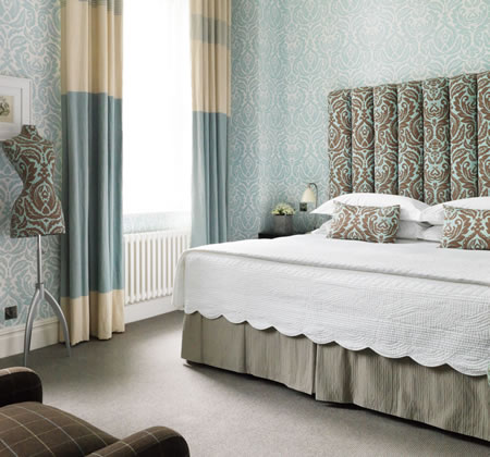
Part of the Firmdale Hotel Group and designed by owner Kit Kemp, the Charlotte Street has set the bar for many Hotel Designers to follow. Kit has spent many an hour sourcing lots of different manufacturers in order to create some inspiring and unique interiors. Thankfully, after a bit of research, I have been able to find some of the exact suppliers and source what I think are some good substitutes for the items which were a little more elusive, for what I like to call "the Blue Room"...

The key element for this rooms' design is the wallpaper and headboard fabric: the Jack Damask by Daniel Croyle. At a reasonable £40 a roll (cheaper than many high street wallpapers I may point out) the wallpaper has been used on all walls, rather than just a feature wall. Combined with the matching fabric in a cleaver colour change, the pattern really comes alive yet doesn't seem to overpower the space, most likely due to the calming colour scheme. The Fabric is a little more pricey at £57 a metre, and you'd probably need approx. 4m for a headboard of a similar design which would set you back around £300, making the Headboard an investment at £500-£550
Cleverly leaving the walls to provide the pattern and excitement, Kit has then used some fairly simple fabrics in the Curtains and Upholstery. Though I couldn't find an exact match, this fabric by Designers Guild is a good alternative, and they have a similar armchair design to that used in this scheme too.

Now, onto Furniture, I think the Keraton Range by Lombok works well with Kit's scheme - this costs £3680 for 2 bedsides, a chest of drawers and a wardrobe. The dark wood in a rustic, masculine form, really compliments what could be considered a feminine backdrop. the Bedside lamp is by Graham and Green, a not-too-bad £130 each: simple and classic.
And finally - what Firmdale Hotel would be complete without the Female Mannequin upholstered to match the headboard? I actually consider this a neat and practical addition to a bedroom and worth the extra expense - approx. £50 for a plain mannequin and then maybe 2.5sq m of fabric to upholster.
So how much would it cost to recreate this room's style? For your average bedroom, I would suggest a budget of £6,000 would do it. Of course, to reduce costs you could substitute the Lombok furniture for the Hemnes Range from Ikea and save £3,000.
I've quite enjoyed taking a look around Kit Kemp's design and am sorely tempted to try another one of her Hotels... the Soho perhaps? But in the meantime, let me know of any Hotel you'd like included in this tour

Tuesday, 19 July 2011

Wallpaper Conundrum


A small feature today on Wallpaper and its applications. Now, I'm a big fan of wallpaper: nothing has a bigger impact on a room than pattern and colour on the vertical surfaces. But it's not always a cut and dry affair when considering how or where to apply it.
Over the decades, wallpaper has fallen in and out of vogue, and its currently experiencing another popularity boost, owed extensively to the hospitality industry and their use of signature wallpapers in 4 and 5* hotels. Designer wallpaper has become synonymous with luxury. Not a day goes by without another celebrity designer hopping on the bandwagon and putting their name to a new range of wallpapers for your local DIY store. But sometimes, it's not what paper you use, but how you use it which makes the real impact. I would say there are maybe 5 different ways of applying wallpaper which can dramatically change your interior.


As you can see in the sketches, the same design has been applied in completely different ways into the same room to generate a different aesthetic. Three of the applications are fairly well used: the "Feature Wall" application, "Full Room" application and the "Low level" application are well recognised methods.


The other two are perhaps a bit more adventurous but do have some valid pros. With high quality designer wallpaper, these applications are often the more practical approach. When a roll of paper costs in excess of £100, a "less is more" approach is a little easier on the purse strings, particularly when you consider that the average roll will only cover around 4 drops – that's an average wall run of 2m. To create a designer style on a budget, using a single strip all around the room or the up and over effect can be a much better solution.

The above image shows this beautiful Jocelyn Warner wallpaper applied in the "up and over" method. It works particularly well with the floral motif which then extends across the ceiling.
Related Posts Plugin for WordPress, Blogger...