Showing posts with label Interior Design. Show all posts

Saturday, 3 March 2012

Inspired by Fashion: Kendi's Buildings & Books

I've said it before and I'll say it again: Interiors follow Fashion. By fashion, I mean those rags you casually throw on every morning without second thought. Or rather, I mean it follows the fashion of those folks who do give a second thought to their daily attire, and in fact give rather more than just a second thought - they give a third and fourth thought too I imagine.

Sadly, I am not one of these people. Though I am quite capable of appreciating a good outfit, I am not and have never been, a fashionable trend setter type person. I am at best a distant admirer of fashion. I'm aware its there. And I do follow a couple of fashion blogs - one of which has given me a swell idea for an ongoing series of posts.

If you are not aware of its existence, I recommend you hop along to Kendi Everyday - a fashion blog which focuses on the fashion of one young trend setter in Dallas. Not every day, but almost, she uploads some snapshots of her outfit for the day with a few choice words and makes it look incredibly easy. And though I know that those great outfits will not look anything like that on me (having not been blessed with a model-like physique) the colours, fabrics and patterns do inspire me.

So, in a round about way, I'm trying to tell you about my new post idea. I shall compose a little interior scheme around an outfit which had been caught in my peripheral vision and has thus inspired me. Hence, Inspired By Fashion. And, to kick start this all of, I have selected this outfit showcased by Kendi last week.


The colour palette is dark - rich warm browns and black. The outfit incorporates contrasting fabrics: leather boots repesented above in the chair, and a sheer blouse represented above by the soft voile window treatment. The wallpaper options pick out the pattern detail and are both available from Cole & Son. The overall look Kendi achived looked smart, yet comfortable, so i've tried to reflect that here with non-fussy furniture with soft detailing.

So... what do you think? x

Saturday, 25 February 2012

Get the Look: MAISON MOSCHINO IVY ROOM

If you recall a few months back I posted a Hotel feature on the Maison Moschino in Madrid and have decide to include this in my "Get the Look" range - and I highly recommend you do get the look as its surprisingly simple to do, and far more achievable than some other Hotel schemes to implement in your own abode.


Firstly, the rooms are imaginative and fun - both key factors in replicating the look - but not entirely practical (rose petal bedspread = not easy to wash!) so its not necessarily a bad idea to deviate slightly from the actual hotel rooms and go at little less OTT. I've looked at two of the rooms - the Ivy room and the Rose room so far - my favourites. I'm saving the Rose room for a later date, but for now...

Here is the Ivy Room Scheme:


The main feature of this room are the stripes. I think you could go with a dark olive or dark blue and achieve the same result - I've shown dark blue in the below scheme as its widely available and a little cheaper. Ikea have some blue & white striped fabrics in store, but I've shown William Yeoward in my scheme as he does a matching St Ives wallpaper.
The bed style requires a decorative ornate headboard which is both framed and upholstered (ideally customers-own-fabric so you can get the stripe) so the frame helps define the headboard against the matching striped wallpaper. The bed below is from Stokers and is called Sofia, but you could use a divan bed with separate headboard (if on a tight budget, headboards of this style can often be picked up at House Clearance shops or even Charity shops for a bargain price, leaving the relatively simple task of upholstering the board in your chosen material.
The Ikea staple, Hemnes Bedroom furniture, is a close match in terms of style and colour, though french shabby chic furniture would also work for a more decorative look. Top the bedside off with a simple shaded lamp.
Finally, add an Ivy garland and drape up the wall. These are available at many garden centres and would really complete the look.

Sunday, 12 February 2012

Get the Look: DESPERATE HOUSEWIVES RENEE


As the vixen on Wisteria Lane with boodles of cash and the co-founder of an Interior Design company to boot, Renee’s Bedroom had to be really impressive to match the character. And it is. In fact, the whole house (formerly home to Edie Britt before her untimely demise) is decked out in some fabulous interior wares. Needless to say, there are a few designer labels dotted about the place. This last season has given us some great shots of Renee’s home, from her textured wall on the stairwell to the uber modern kitchen. I managed to capture a few screenshots of the bedroom and have compiled a little moodboard for anyone looking to create a Renee style boudoir.

The bedding I tracked down at Macy’s and is currently on offer. The bronze tones are complimented by the mocha wallcolour. Combined with splashes on Turquoise, the milky brown is then subdued with white furniture. Though I couldn’t locate the exact pieces used on the show (I’m not from the states and have limited knowledge of their interior industry) I did find some suitable pieces by Italian designer SMA – available at various stockists around Europe. Top it all off with a velvet upholstered Chaise Longue with scroll top detail and you’re onto a winner. The must have piece is the upholstered bed – I found a good match at High Fashion Home – with a high headboard, deep button detailing and winged sides.

Happy shopping!
Mx

Wednesday, 1 February 2012

HOME IMPROVEMENT: Master Bedroom Photo Showcase


So, its not quite complete just yet, but the room is finally coming together. To summarise the scheme so far:
  • The walls have been re-neutralised to a "contemporary" off white with splashes of lime/mint and chocolate.
  • Curtains are a recycled feature of our old living room, by Montgomery
  • The Bedstead is the Leamington by Next
  • Throw from (*shocked face*) Sainsburys
  • Bedding from Next
  • Wardrobe by Argos
  • Bedsides & Chest Of Drawers by Ikea
A lot of our bits and pieces are not new, as we've lived together for almost 8 years now and have acquired things along the way. But the two large pieces (bed & wardrobe) have been bought with longevity in mind and we searched around for the bargains.


The room is not completely dressed yet. I'd like to really make a feature of the bedding and am considering buying some egyptian cotton of a good quality high thread count (600 if i'm lucky). Also, when money is not such a deciding factor, i'd like to incorporate a stunning wallpaper, like the "Elementi Fiamma" by Zoffany. This would look amazing with the zesty greens already used.

Tuesday, 31 January 2012

Neutral Colour Palettes: DARK vs LIGHT


If you’re considering a neutral colour palette for a room, the paint colour which immediately springs to most people’s mind is the great British painter’s staple: Magnolia. But there are various different ways to approach a neutral colour palette.
If you ask an Architect to pick a neutral paint colour for a design, the answer will invariably be White. Brilliant White. This is because white highlights Architectural designs without distracting. White looks lovely on smooth plastered walls and it helps people notice the building design and room proportions: exactly the parts which an Architect is most proud of.
If you ask an Interior Designer to select a neutral paint colour, they’ll offer you anything but white. Taupe, Dove Grey, Camel, Pebble, Mink – just to name a few. Often, these will be from the darker end of the neutral scale – used to create intimate spaces with light pockets and dark corners. This removes the boundaries of a room, making the actual proportions less noticeable and therefore highlighting the room content.

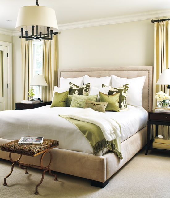
I’ve selected a few choice images of neutral bedroom schemes from both ends of the neutral scale – from light airy beige through to deep earthy browns. You'll notice the paler palettes use darker tones or patterns as a feature, whereas the dark rooms use punches of light to frame or enhance the details.

I think that ultimately, the darker the palette, the more sophisticated the overall look becomes. Is this because we grown ups maybe don't like how things look in the harsh light of day? Perhaps! But also, a darker palette conceals a multitude of sins and therefore stands a better chance of creating a pleasing result.


So... which colour will you be painting your room? Are you a fan of the classic Magnolia, or would you prefer a dove grey backdrop, we'd love to know!
Mx

Wednesday, 25 January 2012

DESIGNER FOCUS: Orla Kiely

She’s become such a success of recent years, chances are you’ve come across Orla Kiely designs in numerous forms. Her fashion line is right up my street – 50’s and 60’s revival, using textured fabrics and retro proportions and cuts to create timeless designs. Her homeware products bend a little bit more towards the 50’s I think, using nature to inspire geometric patterns and neat colour palettes. The most common design I’m aware of is the multi coloured stem print design which has been transferred onto a wealth of merchandise from Radios to cushions to mugs.

Here are a few of my favourite images showing her Interior items. I’m loving the wallpaper in the kitchens but sadly I cannot afford £62 a roll… but if you can, then Heals is the place to go. But I bet there are a few copycat designs available – I shall be perusing Graham & Brown later to see if I can find one for my own home. Also, check out the fab “carpark” duvet covers, currently on sale at Dotmaison.com – I just love the simplicity.

Wednesday, 18 January 2012

NURSERY RHYMES: moodboard

So, having thoroughly scoured the internet for design inspiration and having had some excellent luck in stumbling across some great products, suppliers and DIY tutorials, I am now officially ready to unveil my nursery moodboard.
Drumroll please. Brrrrrrrrrrrrrrrrrr…..

Ta da! I’ve finally decided to go with a woodland theme. Think Alice in Wonderland meets the Gruffalo. I really want to create a space which inspires my daughter’s imagination; so when she’s older and playing with her toys, the room becomes part of the adventure. I want it to last for her childhood, so don’t really want to make it too babyish, so am keen to incorporate some aspects which she won’t necessarily appreciate just yet.
I love these paper pom poms which I’m very keen to make. The wall tranfers have already arrived and I’m about to press the order button on the art print. Keep your eyes peeled for an upcoming completed room post! :D
Mx

Monday, 9 January 2012

Weekly Inspiration #1

One of my New Year's Resolutions was to broaden my blog posts in 2012 and post more regularly. So, in what can only be described as a blatant copying off one of my favourite blogs, Elegant Musings, I have decided to post a weekly (!) inspirational post showing the things on the web which have caught my beedy eye this week, as well as anything which is particuarly influencing my current tastes, be it a newspaper article, upcoming event or film which i've recently watched.

This week, I'm feeling the vintage vibe. I'm looking at our kitchen and none-existant dining area and mulling over the possibilites. The space restrictions have lead me to look at making a boothed seating area, a la the 1950s. Also, i've been looking at vintage pieces for our master bedroom to dress the room. Finally, I saw the film, Revolutionary Road, earlier this week and spent the whole film drooling over the decor, so i've been googling that a fair bit too.

What's been catching your eye this week?
M x

Friday, 6 January 2012

HOME IMPROVEMENT: Master Bedroom


We’ve been in our new abode for a little over a month now, and I’m disappointed with myself that it hasn’t all been completely converted to reflect my tastes. But, as keen as I am to transform this place into my dream home, there have been a few things hindering the process: Christmas for one thing, and my daughter for another. Before motherhood, I saw my maternity leave as a wonderful, restful place where I could finally focus on completing my dream of writing a childrens book, improve my sewing ability and explore new and exciting recipes in the kitchen, and of course redecorate our new house. But as it turns out, children need nurturing. They need entertaining and you really need to keep your attention focused on them. Hmmm. So I’m now just three weeks away from returning to work (albeit part time) and have achieved none of the above. Hmpf.

But it hasn’t all been dirty nappies and bottle feeds this past month. I did manage to make chutneys and pickled onions for Christmas gifts, as well as mince pies and Christmas cake. And in the very miniscule amount of spare time I had, I painted our new Master Bedroom. Hurrah! And what wonderful scheme have I gone with, I hear you ask? Well, it’s all very exciting. The room was painted BRILLIANT WHITE (gasp) which in my opinion, really should only be used in rooms with immaculately plastered walls and excellent light. Our room does not have these things – it has textured wallpaper (double gasp) which I despise. I could have stripped the walls, or have applied Polycell filler everywhere but I didn’t. I’ve just painted on top, but I’ve managed to achieve a much better finish by opting for matt paint as this doesn’t highlight the texture as a silk paint would. And the colour of the newly painted walls is (drumroll please)….. CONTEMPORARY. Oh, that’s not a colour? Well, it’s what it says on the tin. It’s actually the colour of Double Cream. Yes, that’s right – its off-white. Haha! A whole month and I’ve transformed the room from BRILLIANT WHITE to OFF WHITE. But it looks much better, I swear! I’ve also covered up the feature wallpaper which was had a floral vine design on in black and blue-grey.

Now the canvas is restored to a more aesthetically pleasing neutral tone, the room is looking much bigger and lighter. The textured wallpaper, though still present, is not nearly as noticeable. I’ve recycled the curtains from our old house’s living room (as curtains can be a costly affair for good quality and we simply can’t afford that at the moment) and have been hunting for an appropriate light fitting. The new bed has arrived (hurrah) and the wardrobe is on its way. When the main furniture is all in situ, I’ve got to start looking at dressing the room which I’m in two minds over. For the moment, I’ve just used bits we already had and I’m not very happy with the overall look at all.

The curtains are a green/yellow leafy design on an ivory shimmer background, They aren’t my first choice for bedroom curtains really – like I said they were in our living room. And with duel aspect windows, they affect the feel of the room quite a lot. And unfortunately, they don’t fit in with either of the schemes I had in mind. I had been toying very indecisively between a Kelly Hoppen inspired room of very sophisticated taupe and grey and a desperate housewives Susan Mayer style room of a more country, homey feel. I’m not decided yet. But then I came across an article on vintage bedrooms with reconditioned antique finds and REALLY liked the look. So I’m going to sit on it until the robe arrives and decide then. At the moment, vintage is winning out, but it depends on how I feel tomorrow. Hmmm.
So, here for your viewing pleasure are some snapshots of the room at the moment. I will of course post a Completed Room post at a later date, so bets are being taken on which design route we decide to go down.

Tuesday, 20 December 2011

Get The Look: HOME ALONE for the Festive Season


Now most of us like to put up a tree at Christmas, drape every available surface in tinsel or maybe place a festive wreath on the front door. Some go to the extra hassle of adorning their whole home exterior in Christmas lights. But few of us coordinate our whole Interior for the festive season.
The 1990’s genius film, Home Alone, however shows us just how, if we ever chose to do so, a Festive Interior can be achieved. With a rich Berry Red and Holly Green colour scheme running throughout the entire house, the house oozes Festive cheer. It makes me want to crack open the Advocaat and Lemonade just looking at it. Quite a design choice for a family who chooses to spend Christmas anywhere but in their home. Hmmm.
Anyway, taking the Festive cheer of Home Alone and looking at the Master Bedroom in particular (the location for the pivotal scene and exclamation “We slept In!!” which kick-starts a mad rush to the airport) I’ve had a little try and creating a very merry bedroom scheme. If you’re a Christmas nut (haha) then maybe this is for you. It’s not for the faint hearted and a liking of red is a must.

Of course, as the film was made a whopping 20 years ago now, a like for like scheme isn’t very easy to achieve so excuse the poor substitutions for some items. However, the overall look still takes inspiration from the film. The items could be acquired from the following suppliers:
·         Cherry Blossom wallpaper by Graham & Brown
·         Four Poster Bed by Stokers
·         Antionette Bedside by Willis & Gambier
·         Rug by The Rug Company
·         Bedside Lamp by Graham & Green
·         Red Bedding by Debenhams
Do you have any items which you think would complete the festive scheme? Or is there another Crimbo Film which has a fabulous Festive cheery interior? For me, Home Alone is my Christmas guilty pleasure without a doubt! MERRY CHRISTMAS!!!!!!!!

Saturday, 17 December 2011

Get The Look: a DESPERATE HOUSEWIVES bedroom


From the very first episode way back in 2004, I was hooked. I was a Desperate Housewives’ addict from the word go. I would LOVE to live on Wisteria Lane in one of those gorgeous homes, with picket fence and nosy (yet highly entertaining) neighbours to boot. But alas, I am not that lucky. My home doesn’t cut the mustard I’m afraid. It doesn’t have a porch, it isn’t painted lemon yellow and it does not have a front door which you could drive a bus through. But I’m fairly certain that some of the Desperate Housewives bedrooms could work nicely into any home – even mine. So here is my “how to” on achieving a Desperate Housewife bedroom á la Susan Delfino, née Mayer.
As a brief Character Bio, Susan is the artsy one – an illustrator by trade originally and later a primary school art teacher. She’s a dab hand with a paint brush and makes reference to being able to appreciate that art is subjective. Her home, however, is not adorned in designer wares like that of Lee and Bob – there is not an Eames chair in sight – but rather is more homely. The palette is feminine and fresh and she has a definite affiliation with Wicker.  She likes natural materials and seems to have furniture which she has collected along the way, rather than redoing a whole room in one swoop with coordinated pieces. It meshes well without being over themed.
Looking on the web, I’ve found a few pieces which I think conform to the Susan style. Pottery Barn is a firm favourite and I’m fairly certain that the green/blue Paisley bedding seen when Susan is dating Jackson the housepainter is from there (in the episode “Marry me a Little” Season 5). Oh, and they ship to the UK now too. They also have a wicker headboard which is super important in achieving the Susan look, though a similar one is also available from Ikea. Laura Ashley have some cute country furniture which could certainly work and wicker drawer units are available from several online shops.

Add architectural detailing with low level tong and groove panelling to complete the look, wood flooring with an understated area rug and an eclectic range of framed prints to embellish.
And there you go: the effortless Susan Mayer/Delfino bedroom yours for the taking. I can't guarantee that recreating this look in your home will lead instantly to a Mike or Jackson lookalike appearing half naked in your room, but it can't hurt to try, right?

Sunday, 20 November 2011

Grease is the Word: Get the Look


I think that for a generation of teen girls, Grease really was the word. There are few girls who haven’t donned black leggings and a pink satin jacket with the words “pink ladies” emblazoned across the back for a girls’ night out or fancy dress party.  The iconic film with its catchy songs and risqué tale of teen love continues to spawn new fans and romanticises 1950’s America, making us all wish that, despite its lack of internet and sky TV, we had been lucky enough to have been born in the era where a circle skirt was compulsory attire and school looked (almost) fun. But are today’s teenagers still as gripped by the film as we were? Or will the sight of Pink Ladies on a hen do disappear in years to come? No – I think it has a longevity which most films and musicals can only dream of. So, why am I, a self-confessed interiors addict, talking about films and fashion? To help any Pink Lady wannabes out there recreate a true Pink Lady bedroom of course, with a nod the 1978 classic film.

If we look at a screenshot of the movie during Rizzo’s rendition of “look at me I’m Sandra Dee” , we get a great snippet of Marty’s bedroom. Are we surprised the room is mostly Pink and Black? Not really.  Are we surprised that there are pictures of 1950’s heart throbs pinned to the wall above her bed? Nope. And who wouldn’t have wanted to have such a cool bedroom as a teenager? I know I would have killed for my own en suite “powder room” that’s for sure. I’ve searched the web for furniture currently on the market which could help achieve a Pink Lady bedroom with inspiration drawn from Marty’s room.

To begin, the wallpaper in the film is a vintage coral pink swan design and there are a couple of options available for this: the Flamingo design by Cole and Son (£55 a roll) or Swan Lake by Nina Campbell (£52 a roll) both available from Wallpaper Direct. Use this in moderation like Marty, as a Feature Bedhead wall.
Accessorise: Marty is a real man eater and clearly a fan of Elvis and James Dean. If old 50’s heart throbs aren’t your thing though, how about using black and white photos of your own teen crush instead? But I’ve got to say, who wouldn’t have drooled over James Dean in this picture? Marty also shows her arty side with her half-finished Paint By Number’s Horse picture and a patriotic token Rydell High banner in red.

Furniture: Marty’s room is nice and girly on the colour side but has some fairly plain and simple furniture, much in-keeping with the era. The Ikea Brimnes bed with its headboard storage is ideal for a teenager’s room and matching simple bedsides and chest of drawers to complete the basics. Marty also has a deco style dressing table with marble effect top and vanity mirror –but I love this 1950’s style one available from Bouf.com.

Her bedding sticks with the pink and black colour scheme, much like this vintage 50’s fabric with lighting in the form of a tripod standard lamp and simple bedside light. Finally, finish the room with a weave chair like this one available from utilty – a classic 50’s design.

Is there anything else which you think should go in a Pink Lady bedroom? Feel free to leave comments and links below,
Oh, I forgot about the wall colour! in the words of Rizzo: Peachy Cream.

Vintage Inspiration

I’ve been truly inspired this week by Elegant Musings and her recent post displaying her new home. Though she mainly displays fabulous posts on sewing, knitting and the occasional cookery snippet, our favourite blogger Casey also gives us the rare insight into (what is I’m certain) her gorgeous vintage inspired home. A slave to vintage fashion, I love how Casey takes select pieces from the past, be it sewing pattern, fabric print or general accessories, and makes them truly fit her style. She’s chic, she’s vintage and she’s one creative gal. Oh, did I mention she has AMAZING taste as well? Enough gushing – let’s get onto the real topic. As I was saying, Casey this week has shown us a beautiful poster by Charles Ammos, and those following my Facebook page will know it got me internet hunting a vintage print for my own abode.

Ever seen the Pixar film “Up”? Well, the film has loads of artwork featured in it done in cool 1920-1930 style. Clear geometric images of landscapes, bold type and gorgeous vibrant colour palettes. In fact, the great poster designer, Eric Tan, created a series of Posters for the films which completely embodies the Art Deco poster style displayed in the film and true to many Travel and Recreational posters of the era. What I really love are the landscapes. Austria, Japan and Cairo have never looked so appealing to me than when shown in a Vintage Poster. This was back in the day when photography didn’t do a place justice and bold, colourful artwork showed us the world beyond our doorstep, got our imaginations going and encouraged us to literally broaden our horizons. I think this type of Poster – the Deco Travel poster – is one of the most beautiful forms of modern art… though I doubt many Galleries would pay homage to it, mores the pity.

So it got me thinking. Can you create a vintage inspired interior without going too “Antwacky” (that’s Bad Taste Antique-y to all you non-scousers out there). I think you can, but it’s about being selective. Pick your vintage pieces carefully and incorporate modern flavours too. Don’t pick a vintage William Morris wallpaper to go with your vintage bureau and antique drinks cabinet and Louis VI chair- it’s too much. Less is more when it comes to vintage. Vintage interiors didn’t have to fight against the mod-coms of the modern home: 42” Plasma TVs, Wiis, ipods or microwave ovens. Vintage stood alone and defined the room.  I like the interior colour palettes of the early 20th century – the mauves of raw plasterwork, the heritage reds and blues; the vibrant arsenic greens and acidic yellows which were plucked directly from nature. A contemporary bedstead could be heightened by a vintage floral feature wallpaper, and a simple uncluttered space would benefit from more elaborate statement furniture.
The fact of the matter is this: with the world economy in recession, with rate of unemployment growing steadily each day, the reality is the majority of us no longer have the luxury of buying new. Vintage is the fashion – through necessity. We recycle, we rebuild, we regenerate. We inject new life into what was once thought to be old and worn. It’s all just a matter of imagination really.
 

Monday, 7 November 2011

Creative Interiors: Hotel Maison Moschino


I love Hotel design, particularly when Hotels push the boundaries and break the mould. Yes, we all love to wander into a stylish hotel and marvel at how coordinated the furnishings are, how comfy the mattress is etc etc. But design, really imaginative design, works on a whole other level. These are the 5* hotels dreams are made of – the ones where an imaginative architect, interior designer and more importantly, a client willing to trust their designers, have worked tirelessly to make their hotel the one to which all others aspire. They’re not common and we average Joes will most likely never have the pleasure of staying a night in one, but that just makes them even more appealing. I’m talking the like of the Sanderson in London, The Hotel Puerta Americas in Madrid, and now included in the ranks, the Maison Moschino hotel in Madrid.
The Maison Moschino has a clear concept which is creatively expressed throughout the Hotel and inkeeping with the fashion brand.
“True to the essence of the Moschino brand, we completely reinterpreted the building, adding 65 contemporary hotel rooms and junior suites inspired by a visionary and contemporary fairy tale theme. Spread out across four floors, the rooms are sensuous visions of surreal diversity. Entering the Maison Moschino is like falling down the rabbit hole: after a while, you come to expect the unexpected.
Highly imaginative and eccentric, we created the spaces to inspire the mind while the body relaxes – because to sleep is perchance to dream. The hotel features several luxurious amenities supporting the surreal Moschino theme: the imaginative menu served in our "Clandestino Milano" restaurant, the dreamlike drinks welcoming you in our exquisite ground floor bar, and the elysian atmosphere of our Culti Spa.

Welcome to Maison Moschino, where four stars meet a few clouds – and the occasional teacup table, forest bedpost, and rose petal-covered bedspread.”

I really love how whole heartedly the theme has been implemented into the rooms. What pleases me most about this type of boutique hotel is how multiple room schemes are used and how varied these schemes are – they don’t simply opt for a different coloured scattered cushion, they re-invent the concept from scratch to produce a unique design. Hotels used to aspire to a create rooms of a better quality than at home domesticity but essentially, they sought to provide a home-away-from-home experience where familiarity would relax and comfort. These concept hotels look to abandon familiarity and instead seek to provide an experience far away from domestic design –a real “Alice down the Rabbit Hole” adventure.

Out of the Moschino rooms, I really love the Forrest concept - its simplicity in colour and quirky use of woodland creatures appeals to me, for sure. I also LOVE the rose petal bedspread and am truely baffled as to how that actually works in a Hotel environment (seriously, how do they wash that?!). I also love the Ivy room with matching striped wall and headboard - its like an optical illusion.
I think it’s only a matter of time before this "concept design" makes its way into our homes – we are already seeing products emerge on the high street of a quirky nature (Next have a beautiful Teacup &  Saucer lamp i'm currently coveting). Will home design become akin to stage design in the near future?
M x

Thursday, 3 November 2011

Achieving a Titanic Interior: get the look for 2012

With 2012 marking a century since the tragic sinking of the RMS Titanic, many eyes are looking fondly back through design archives, looking to re-acquire the magic of Titanic. The White star Line giant was constructed primarily in the shipyards of Belfast, Ireland and housed some of the most spectacular interiors in history. Itself taking influences from many design eras including Jacobean, Louis XVI, Louis XV, Georgian and Queen Anne, the Titanic style is now becoming a hot trend for Interiors of 2012. Though achieving the magnificence of Titanic to a smaller budget and within the limitations of a family home may seem somewhat daunting, it is none the less achievable.
The key to taking inspiration from historical influences is not to create a replica of the style, but to take flavours of the era and fuse these with more contemporary elements. To cover your 8ft x 10ft dining room in wall to wall, floor to ceiling mahogany panelling with hand carved detailing in homage to the first class smoking room would not work. But taking the principles of the colour palette, displaying a print from the era or opting for a titanic inspired lighting theme may be more successful.
As always, I’m looking at bringing a little Titanic glory into the bedroom design. For anybody who has seen the 1997 blockbuster of the ships sinking, you may remember the labyrinth of rooms which Rose and Hal occupied on the maiden voyage. I think the film portrays a fairly accurate example of first class accommodation and its worth examining for inspiration.

Though many of Titanic’s rooms were panelled to recreate opulent stately home-style décor, this is not really practical for modern home design as most homes don’t have rooms of the correct dimensions to allow this to work. But achieving a panelled look can be easily achieved by applying MDF panels and dado detailing to a single wall. Rather than dominating the space in a Mahogany stain, opt for a more neutral colour like Taupe or Stone. This way, you are adding architectural detailing without distracting from other elements. Keep it simple and make the panelling proportionate to the room, with simplistic moulding rather than an over embellished cornice.
Wallpaper was a real luxury of the early 20th century and some designs are being revampted for the modern market. Little Greene have some reproduction wallpaper prints which have been tweaked but are heavily based on original designs. The 1915 Marlborough design is a few years late for Titanic but certainly contains the right elements. Alternatively, the Rococco design by Cole & Son would work perfectly. Again, I prefer the muted greys, taupe and cream designs where the pattern design is subtle as I find the design is more impressive when subdued.
Lighting is another key element – spotlights & halogens are a no go on this one – instead look for creating a more intimate lighting scheme to create a quiet romantic air. For a contemporary take, use low hung pendant lighting for bedside illumination rather than table lamps, keeping your nightstand free and uncluttered.
Finally onto the Furniture and accessories: I think that if you have kept with a fairly neutral colour scheme up to now, opting for richer furniture and bold colours will pay off to complete the titanic vibe. Don’t be afraid to mix styles – the more dramatic the better. Graham & Green have lots of gorgeous pieces which take inspiration from early 20th Century design. If you’re after detailed dark wood items, Stokers are also a good place to look for Bedsteads and Nightstands with a huge selection to choose from. In Accessories and staging, I love the idea of having three staggered mirrors like these Lucille Mirrors – they’re decorative and have an eclectic vibe and I can imagine being dolled up in full Dinner Attire and using these to get the full 360 of an outfit.
So there you go – Titanic style in bite sized pieces. Here is my take on using titanic influence within bedroom design, hope you like!
M x
Related Posts Plugin for WordPress, Blogger...