Sunday, 20 November 2011

Grease is the Word: Get the Look


I think that for a generation of teen girls, Grease really was the word. There are few girls who haven’t donned black leggings and a pink satin jacket with the words “pink ladies” emblazoned across the back for a girls’ night out or fancy dress party.  The iconic film with its catchy songs and risqué tale of teen love continues to spawn new fans and romanticises 1950’s America, making us all wish that, despite its lack of internet and sky TV, we had been lucky enough to have been born in the era where a circle skirt was compulsory attire and school looked (almost) fun. But are today’s teenagers still as gripped by the film as we were? Or will the sight of Pink Ladies on a hen do disappear in years to come? No – I think it has a longevity which most films and musicals can only dream of. So, why am I, a self-confessed interiors addict, talking about films and fashion? To help any Pink Lady wannabes out there recreate a true Pink Lady bedroom of course, with a nod the 1978 classic film.

If we look at a screenshot of the movie during Rizzo’s rendition of “look at me I’m Sandra Dee” , we get a great snippet of Marty’s bedroom. Are we surprised the room is mostly Pink and Black? Not really.  Are we surprised that there are pictures of 1950’s heart throbs pinned to the wall above her bed? Nope. And who wouldn’t have wanted to have such a cool bedroom as a teenager? I know I would have killed for my own en suite “powder room” that’s for sure. I’ve searched the web for furniture currently on the market which could help achieve a Pink Lady bedroom with inspiration drawn from Marty’s room.

To begin, the wallpaper in the film is a vintage coral pink swan design and there are a couple of options available for this: the Flamingo design by Cole and Son (£55 a roll) or Swan Lake by Nina Campbell (£52 a roll) both available from Wallpaper Direct. Use this in moderation like Marty, as a Feature Bedhead wall.
Accessorise: Marty is a real man eater and clearly a fan of Elvis and James Dean. If old 50’s heart throbs aren’t your thing though, how about using black and white photos of your own teen crush instead? But I’ve got to say, who wouldn’t have drooled over James Dean in this picture? Marty also shows her arty side with her half-finished Paint By Number’s Horse picture and a patriotic token Rydell High banner in red.

Furniture: Marty’s room is nice and girly on the colour side but has some fairly plain and simple furniture, much in-keeping with the era. The Ikea Brimnes bed with its headboard storage is ideal for a teenager’s room and matching simple bedsides and chest of drawers to complete the basics. Marty also has a deco style dressing table with marble effect top and vanity mirror –but I love this 1950’s style one available from Bouf.com.

Her bedding sticks with the pink and black colour scheme, much like this vintage 50’s fabric with lighting in the form of a tripod standard lamp and simple bedside light. Finally, finish the room with a weave chair like this one available from utilty – a classic 50’s design.

Is there anything else which you think should go in a Pink Lady bedroom? Feel free to leave comments and links below,
Oh, I forgot about the wall colour! in the words of Rizzo: Peachy Cream.

Vintage Inspiration

I’ve been truly inspired this week by Elegant Musings and her recent post displaying her new home. Though she mainly displays fabulous posts on sewing, knitting and the occasional cookery snippet, our favourite blogger Casey also gives us the rare insight into (what is I’m certain) her gorgeous vintage inspired home. A slave to vintage fashion, I love how Casey takes select pieces from the past, be it sewing pattern, fabric print or general accessories, and makes them truly fit her style. She’s chic, she’s vintage and she’s one creative gal. Oh, did I mention she has AMAZING taste as well? Enough gushing – let’s get onto the real topic. As I was saying, Casey this week has shown us a beautiful poster by Charles Ammos, and those following my Facebook page will know it got me internet hunting a vintage print for my own abode.

Ever seen the Pixar film “Up”? Well, the film has loads of artwork featured in it done in cool 1920-1930 style. Clear geometric images of landscapes, bold type and gorgeous vibrant colour palettes. In fact, the great poster designer, Eric Tan, created a series of Posters for the films which completely embodies the Art Deco poster style displayed in the film and true to many Travel and Recreational posters of the era. What I really love are the landscapes. Austria, Japan and Cairo have never looked so appealing to me than when shown in a Vintage Poster. This was back in the day when photography didn’t do a place justice and bold, colourful artwork showed us the world beyond our doorstep, got our imaginations going and encouraged us to literally broaden our horizons. I think this type of Poster – the Deco Travel poster – is one of the most beautiful forms of modern art… though I doubt many Galleries would pay homage to it, mores the pity.

So it got me thinking. Can you create a vintage inspired interior without going too “Antwacky” (that’s Bad Taste Antique-y to all you non-scousers out there). I think you can, but it’s about being selective. Pick your vintage pieces carefully and incorporate modern flavours too. Don’t pick a vintage William Morris wallpaper to go with your vintage bureau and antique drinks cabinet and Louis VI chair- it’s too much. Less is more when it comes to vintage. Vintage interiors didn’t have to fight against the mod-coms of the modern home: 42” Plasma TVs, Wiis, ipods or microwave ovens. Vintage stood alone and defined the room.  I like the interior colour palettes of the early 20th century – the mauves of raw plasterwork, the heritage reds and blues; the vibrant arsenic greens and acidic yellows which were plucked directly from nature. A contemporary bedstead could be heightened by a vintage floral feature wallpaper, and a simple uncluttered space would benefit from more elaborate statement furniture.
The fact of the matter is this: with the world economy in recession, with rate of unemployment growing steadily each day, the reality is the majority of us no longer have the luxury of buying new. Vintage is the fashion – through necessity. We recycle, we rebuild, we regenerate. We inject new life into what was once thought to be old and worn. It’s all just a matter of imagination really.
 

Monday, 7 November 2011

Creative Interiors: Hotel Maison Moschino


I love Hotel design, particularly when Hotels push the boundaries and break the mould. Yes, we all love to wander into a stylish hotel and marvel at how coordinated the furnishings are, how comfy the mattress is etc etc. But design, really imaginative design, works on a whole other level. These are the 5* hotels dreams are made of – the ones where an imaginative architect, interior designer and more importantly, a client willing to trust their designers, have worked tirelessly to make their hotel the one to which all others aspire. They’re not common and we average Joes will most likely never have the pleasure of staying a night in one, but that just makes them even more appealing. I’m talking the like of the Sanderson in London, The Hotel Puerta Americas in Madrid, and now included in the ranks, the Maison Moschino hotel in Madrid.
The Maison Moschino has a clear concept which is creatively expressed throughout the Hotel and inkeeping with the fashion brand.
“True to the essence of the Moschino brand, we completely reinterpreted the building, adding 65 contemporary hotel rooms and junior suites inspired by a visionary and contemporary fairy tale theme. Spread out across four floors, the rooms are sensuous visions of surreal diversity. Entering the Maison Moschino is like falling down the rabbit hole: after a while, you come to expect the unexpected.
Highly imaginative and eccentric, we created the spaces to inspire the mind while the body relaxes – because to sleep is perchance to dream. The hotel features several luxurious amenities supporting the surreal Moschino theme: the imaginative menu served in our "Clandestino Milano" restaurant, the dreamlike drinks welcoming you in our exquisite ground floor bar, and the elysian atmosphere of our Culti Spa.

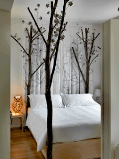
Welcome to Maison Moschino, where four stars meet a few clouds – and the occasional teacup table, forest bedpost, and rose petal-covered bedspread.”

I really love how whole heartedly the theme has been implemented into the rooms. What pleases me most about this type of boutique hotel is how multiple room schemes are used and how varied these schemes are – they don’t simply opt for a different coloured scattered cushion, they re-invent the concept from scratch to produce a unique design. Hotels used to aspire to a create rooms of a better quality than at home domesticity but essentially, they sought to provide a home-away-from-home experience where familiarity would relax and comfort. These concept hotels look to abandon familiarity and instead seek to provide an experience far away from domestic design –a real “Alice down the Rabbit Hole” adventure.

Out of the Moschino rooms, I really love the Forrest concept - its simplicity in colour and quirky use of woodland creatures appeals to me, for sure. I also LOVE the rose petal bedspread and am truely baffled as to how that actually works in a Hotel environment (seriously, how do they wash that?!). I also love the Ivy room with matching striped wall and headboard - its like an optical illusion.
I think it’s only a matter of time before this "concept design" makes its way into our homes – we are already seeing products emerge on the high street of a quirky nature (Next have a beautiful Teacup &  Saucer lamp i'm currently coveting). Will home design become akin to stage design in the near future?
M x

Thursday, 3 November 2011

Achieving a Titanic Interior: get the look for 2012

With 2012 marking a century since the tragic sinking of the RMS Titanic, many eyes are looking fondly back through design archives, looking to re-acquire the magic of Titanic. The White star Line giant was constructed primarily in the shipyards of Belfast, Ireland and housed some of the most spectacular interiors in history. Itself taking influences from many design eras including Jacobean, Louis XVI, Louis XV, Georgian and Queen Anne, the Titanic style is now becoming a hot trend for Interiors of 2012. Though achieving the magnificence of Titanic to a smaller budget and within the limitations of a family home may seem somewhat daunting, it is none the less achievable.
The key to taking inspiration from historical influences is not to create a replica of the style, but to take flavours of the era and fuse these with more contemporary elements. To cover your 8ft x 10ft dining room in wall to wall, floor to ceiling mahogany panelling with hand carved detailing in homage to the first class smoking room would not work. But taking the principles of the colour palette, displaying a print from the era or opting for a titanic inspired lighting theme may be more successful.
As always, I’m looking at bringing a little Titanic glory into the bedroom design. For anybody who has seen the 1997 blockbuster of the ships sinking, you may remember the labyrinth of rooms which Rose and Hal occupied on the maiden voyage. I think the film portrays a fairly accurate example of first class accommodation and its worth examining for inspiration.

Though many of Titanic’s rooms were panelled to recreate opulent stately home-style décor, this is not really practical for modern home design as most homes don’t have rooms of the correct dimensions to allow this to work. But achieving a panelled look can be easily achieved by applying MDF panels and dado detailing to a single wall. Rather than dominating the space in a Mahogany stain, opt for a more neutral colour like Taupe or Stone. This way, you are adding architectural detailing without distracting from other elements. Keep it simple and make the panelling proportionate to the room, with simplistic moulding rather than an over embellished cornice.
Wallpaper was a real luxury of the early 20th century and some designs are being revampted for the modern market. Little Greene have some reproduction wallpaper prints which have been tweaked but are heavily based on original designs. The 1915 Marlborough design is a few years late for Titanic but certainly contains the right elements. Alternatively, the Rococco design by Cole & Son would work perfectly. Again, I prefer the muted greys, taupe and cream designs where the pattern design is subtle as I find the design is more impressive when subdued.
Lighting is another key element – spotlights & halogens are a no go on this one – instead look for creating a more intimate lighting scheme to create a quiet romantic air. For a contemporary take, use low hung pendant lighting for bedside illumination rather than table lamps, keeping your nightstand free and uncluttered.
Finally onto the Furniture and accessories: I think that if you have kept with a fairly neutral colour scheme up to now, opting for richer furniture and bold colours will pay off to complete the titanic vibe. Don’t be afraid to mix styles – the more dramatic the better. Graham & Green have lots of gorgeous pieces which take inspiration from early 20th Century design. If you’re after detailed dark wood items, Stokers are also a good place to look for Bedsteads and Nightstands with a huge selection to choose from. In Accessories and staging, I love the idea of having three staggered mirrors like these Lucille Mirrors – they’re decorative and have an eclectic vibe and I can imagine being dolled up in full Dinner Attire and using these to get the full 360 of an outfit.
So there you go – Titanic style in bite sized pieces. Here is my take on using titanic influence within bedroom design, hope you like!
M x
Related Posts Plugin for WordPress, Blogger...